GEICO
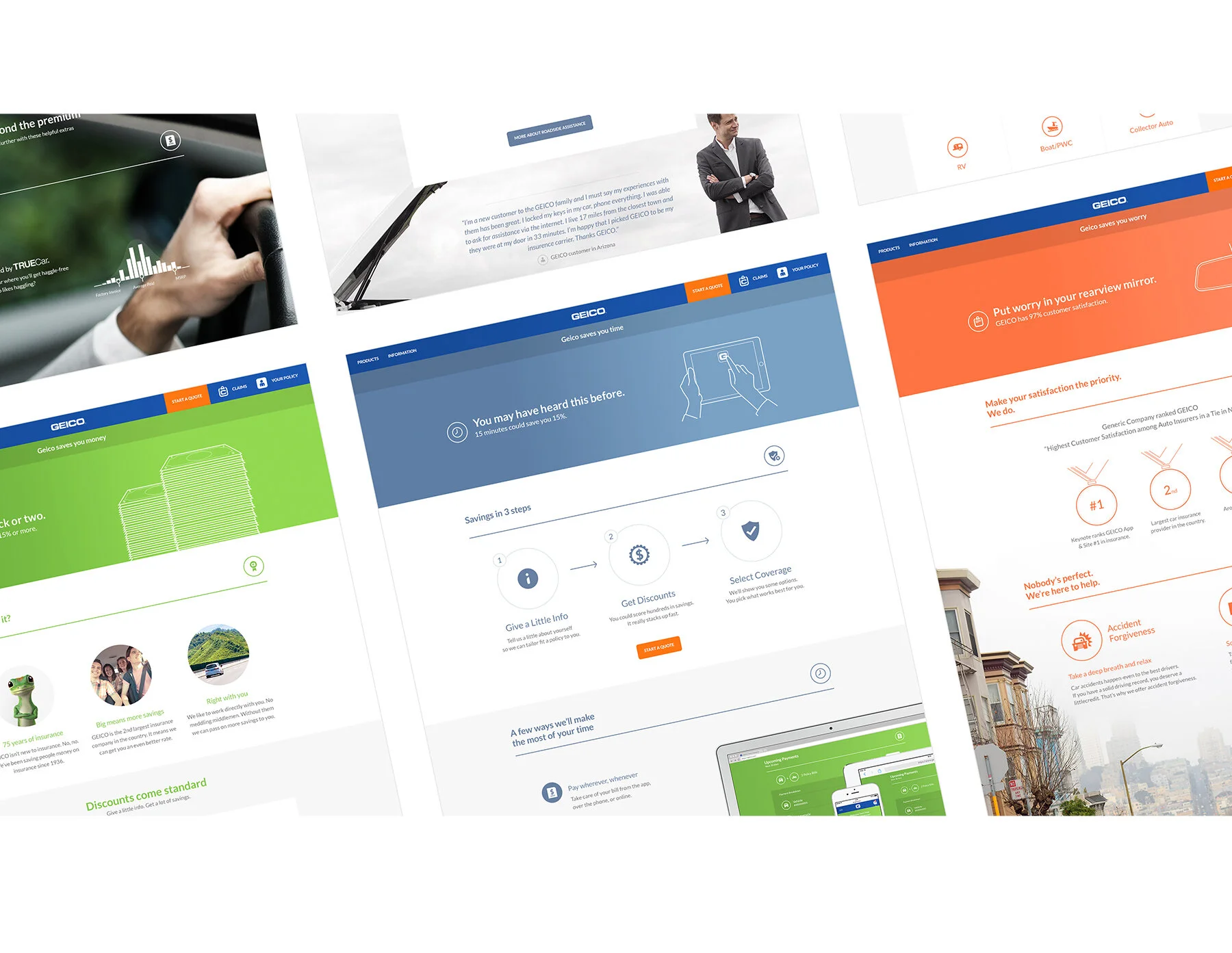
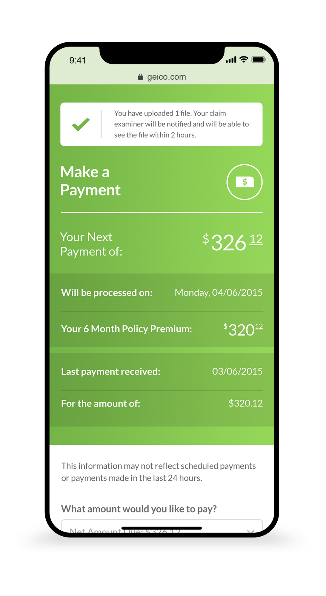
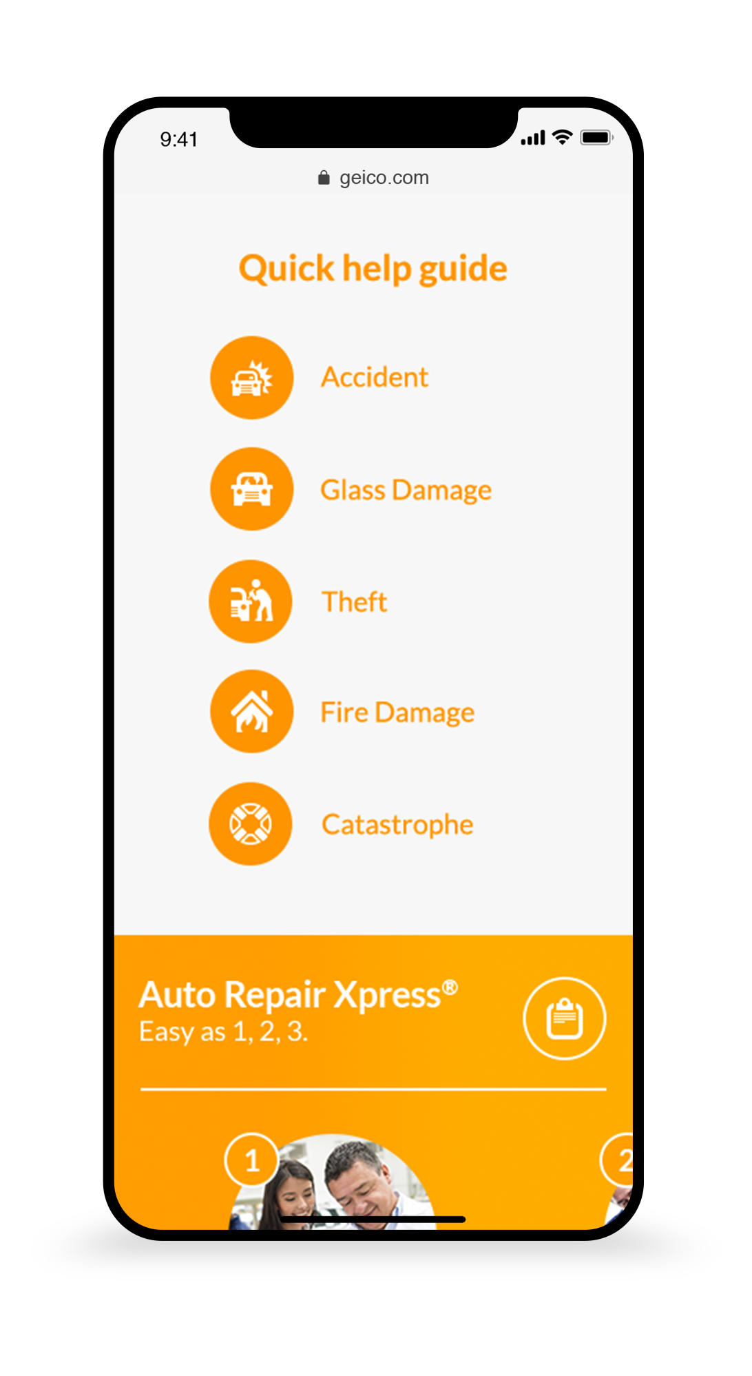
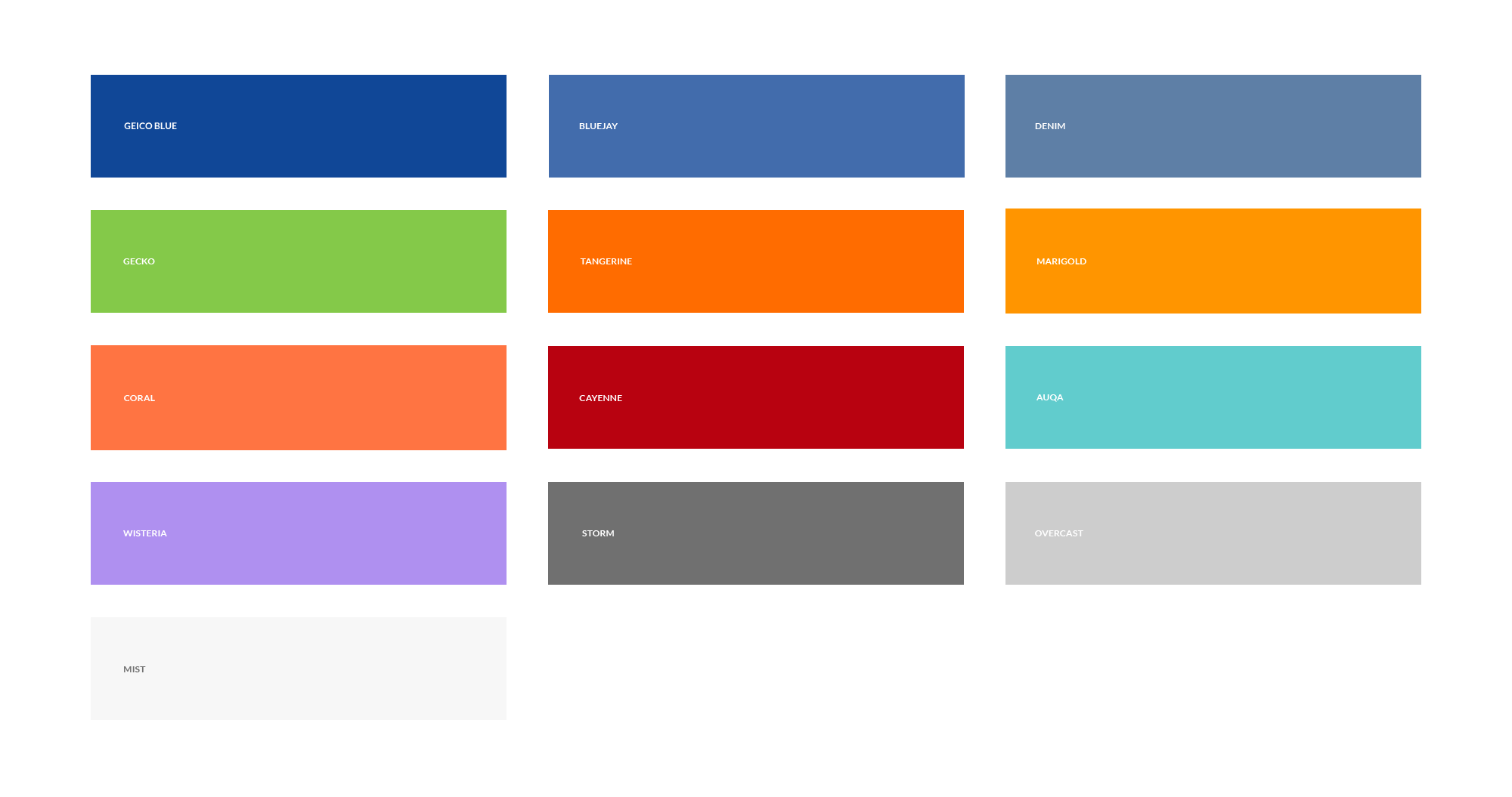
After developing both the app and a site reskin, this final project was the full redesign of GEICO’s online experience. We re-imagined the sites look and adjusted its content to give each page proper hierarchy to maximize user flow. We developed a new library of functional elements, colors, and imagery. The year long project resulted in a new sophisticated look for the brand.
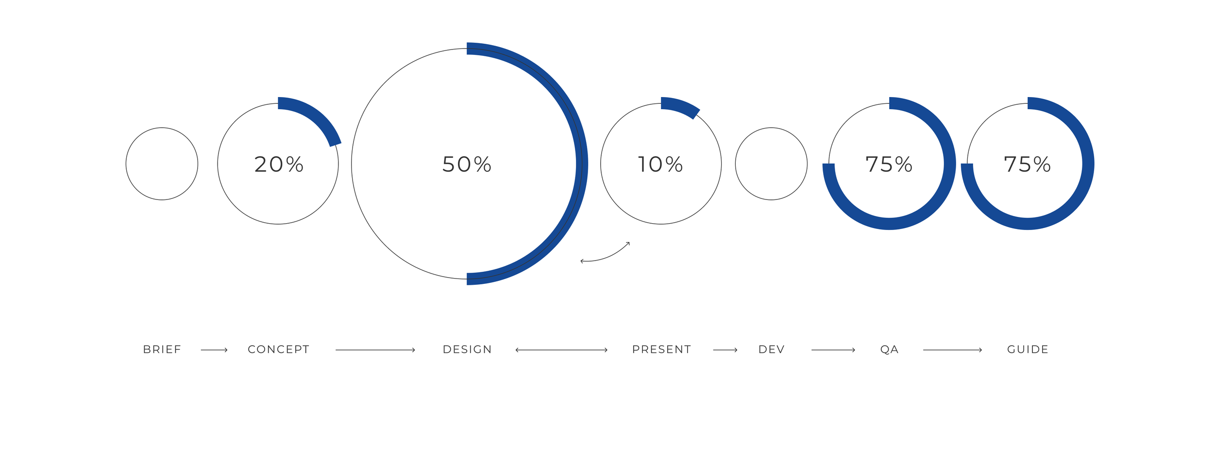
PROCESS & ROLE
timeline
1yr
UX/UI Designer
RESEARCH & IDEATION
Having a very close, long-term partnership with GEICO, the parameters of the project were loose—refresh the design of the website. Consisting of the same five core team members from the GEICO App, we already had ideas about how we could update the existing website.
TESTING
My job was to take the approved page concepts and create component libraries by defining styles and elements for how they would be used across the site.
SYNTHESIS
Each individual component was developed by us. We did this by creating a live-coded guide (including transitions) for the GEICO team to simply copy and paste into their HTML. Rigorous reviews were done before handoff.