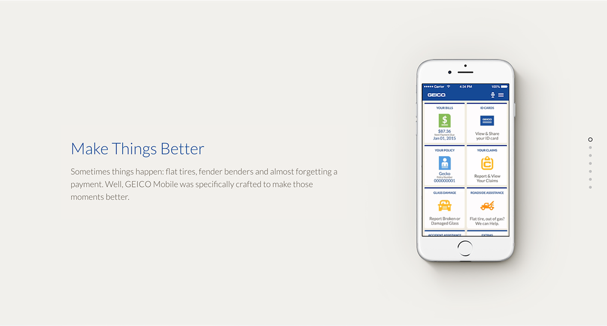
GEICO App
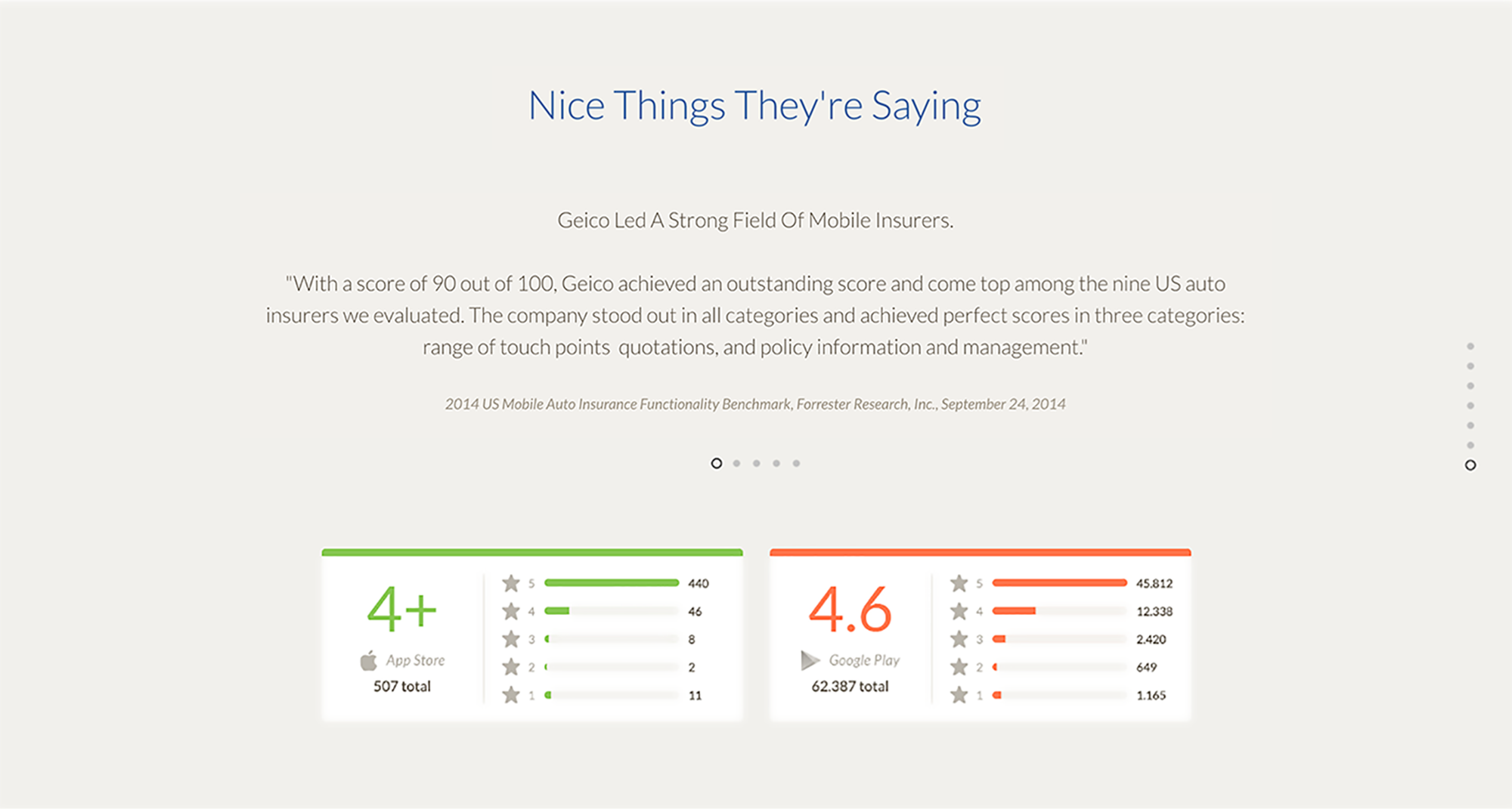
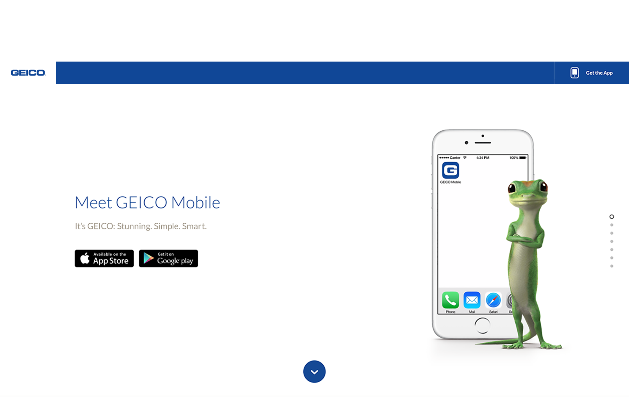
This case study promoted the design and ease of use of GEICO’s redesigned app. The app has since been recognized as no. 1 in the industry for 4 years in a row. This project took 2 years from concept to development.
process & role
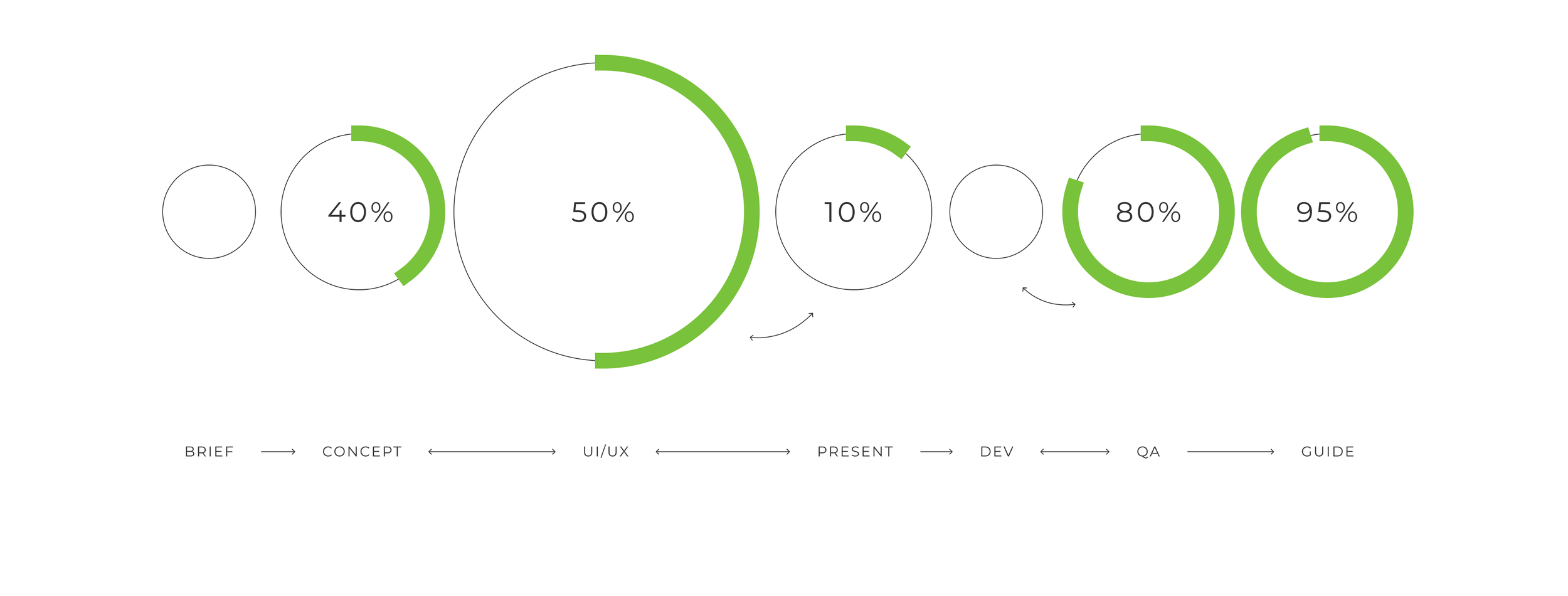
TIMELINE
2YRS
UI/UX Designer
research & ideation
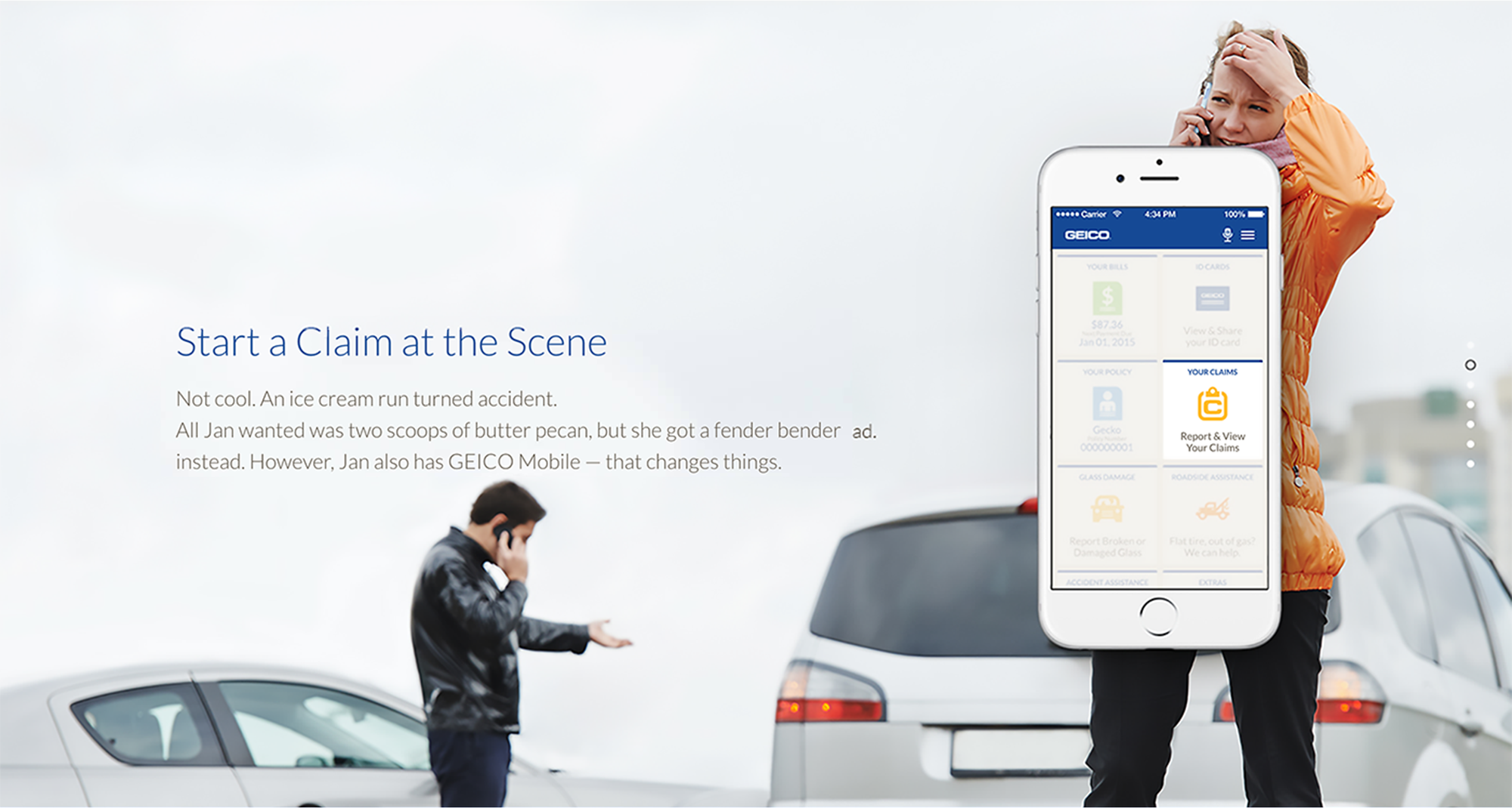
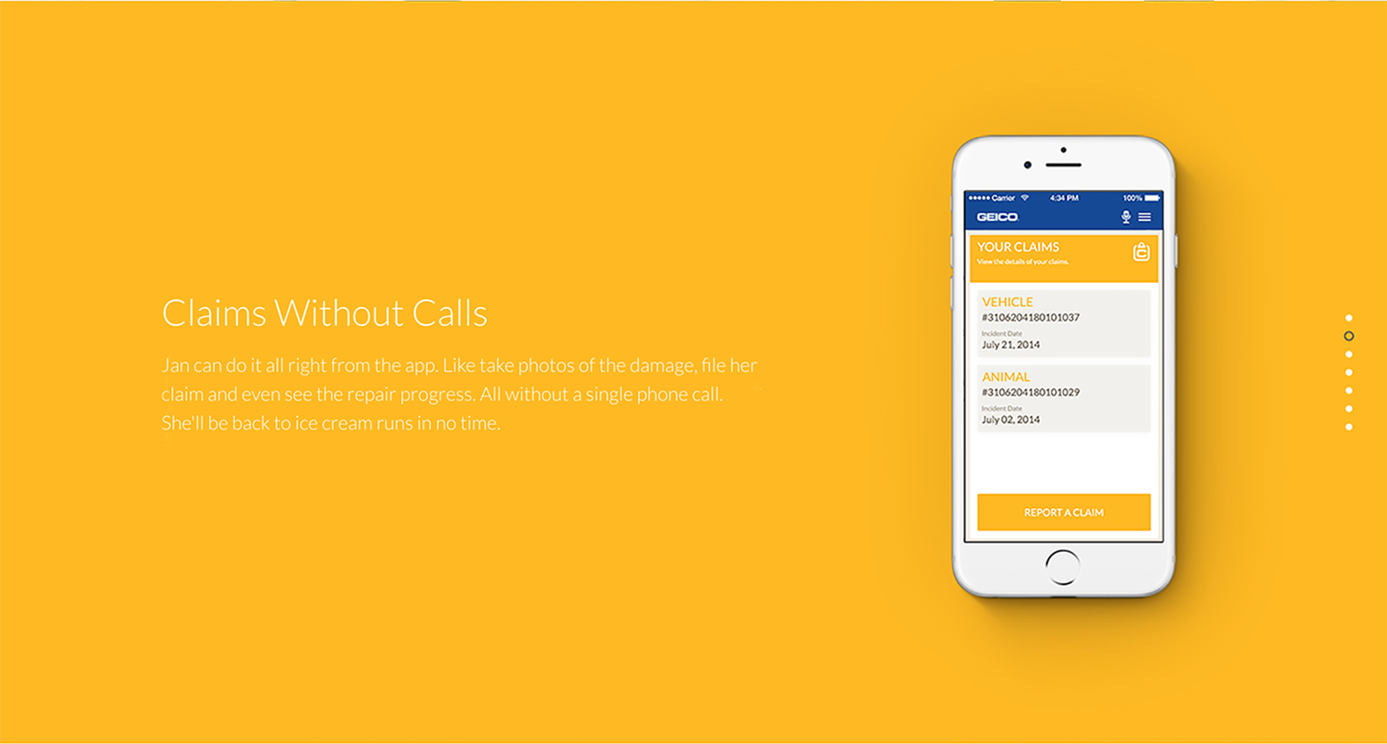
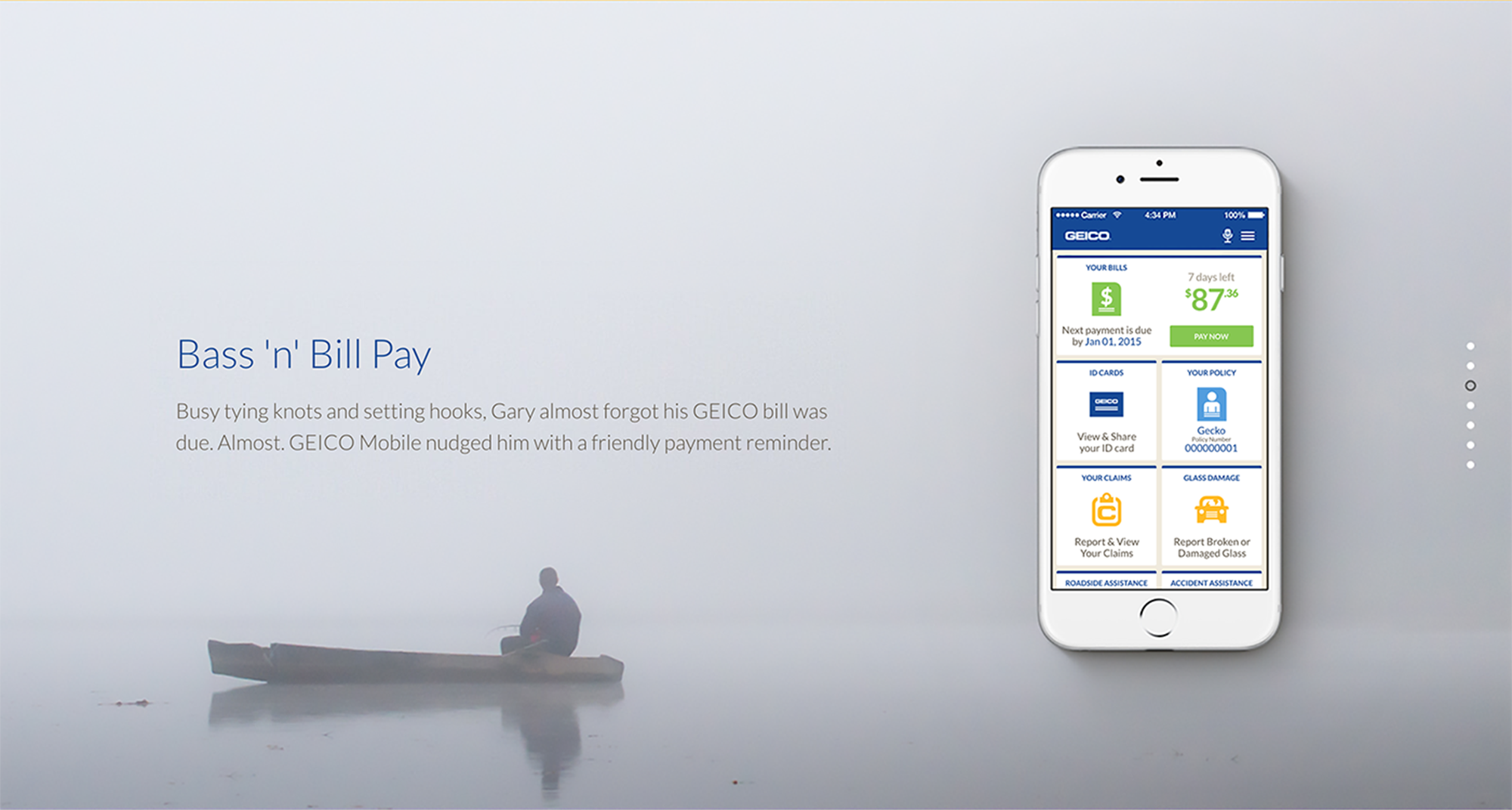
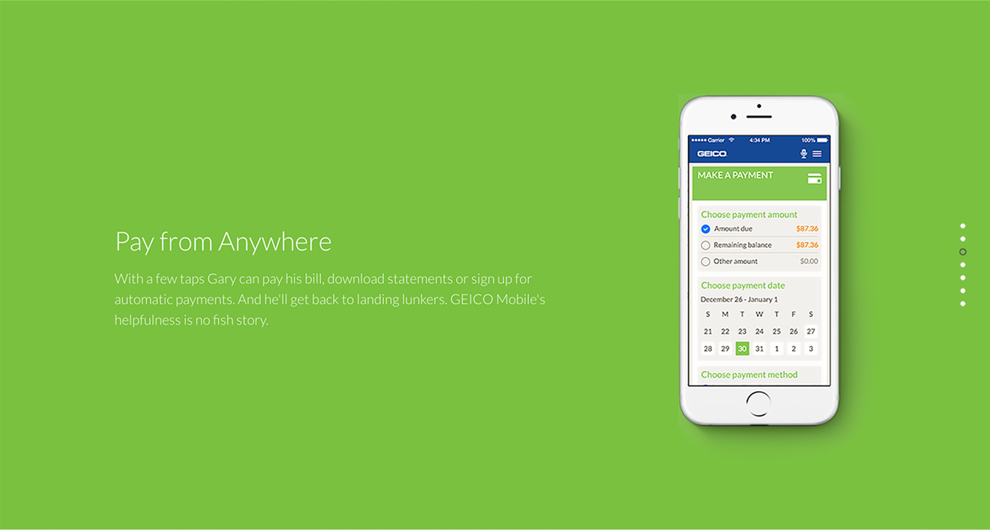
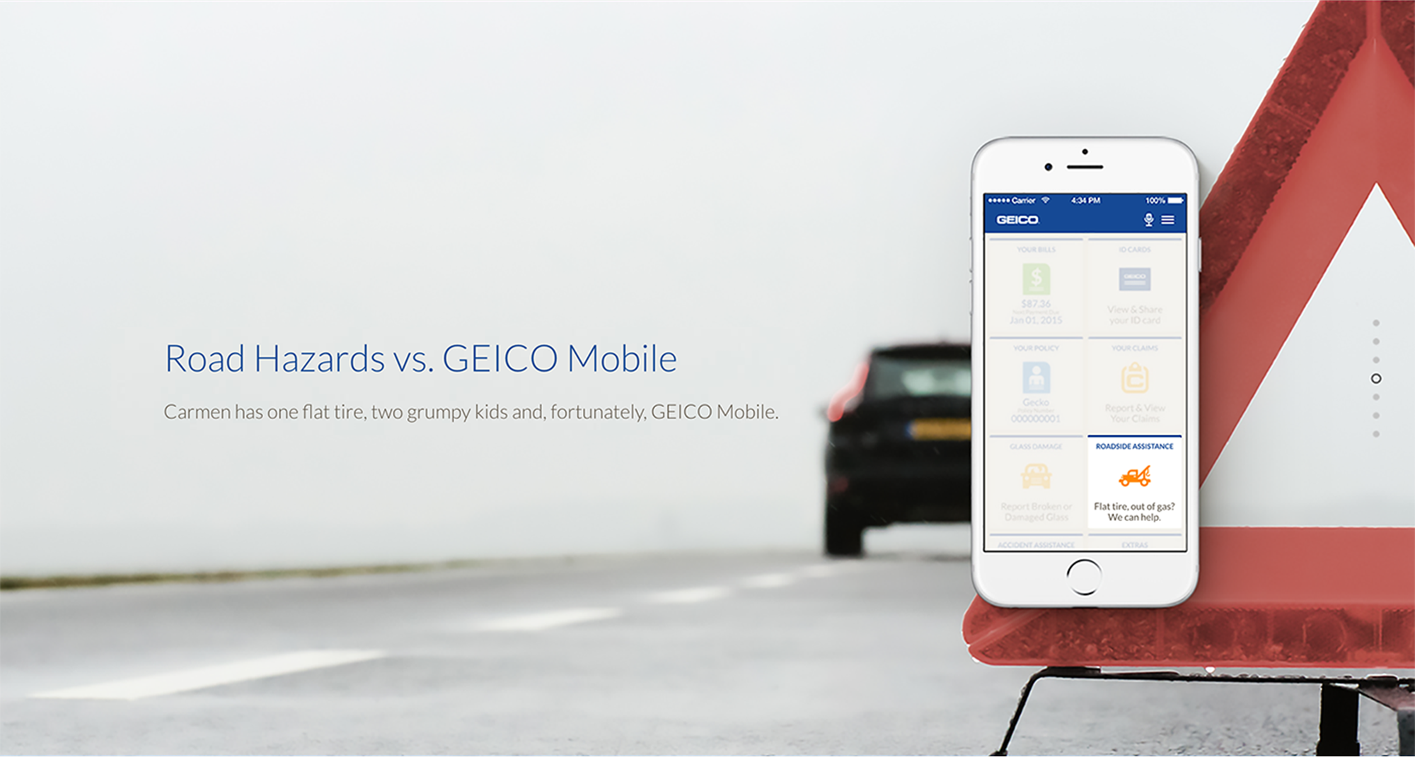
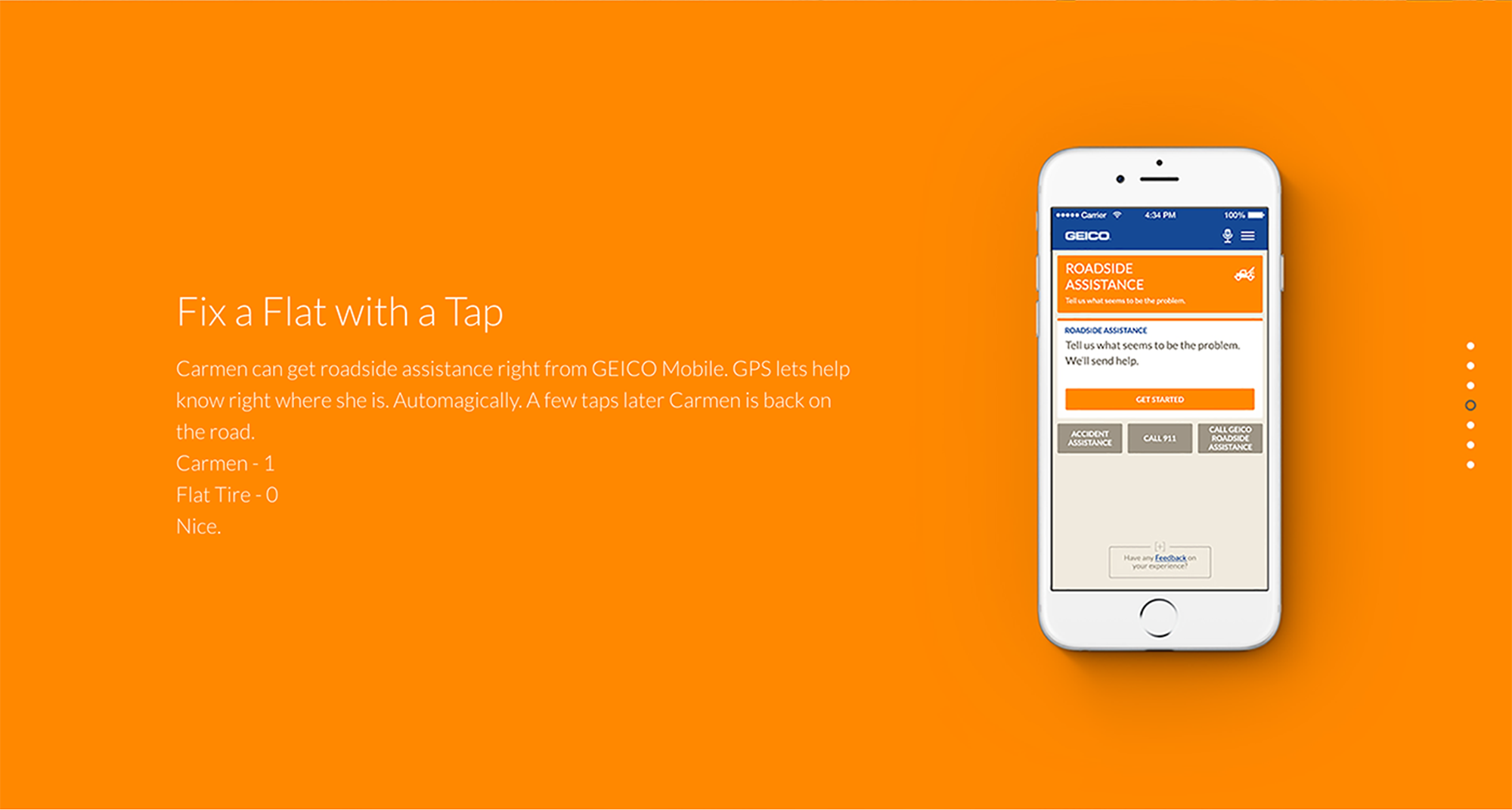
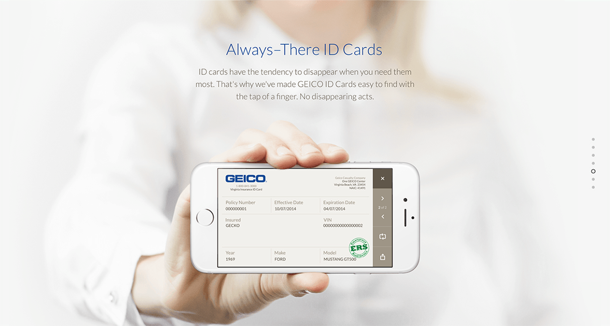
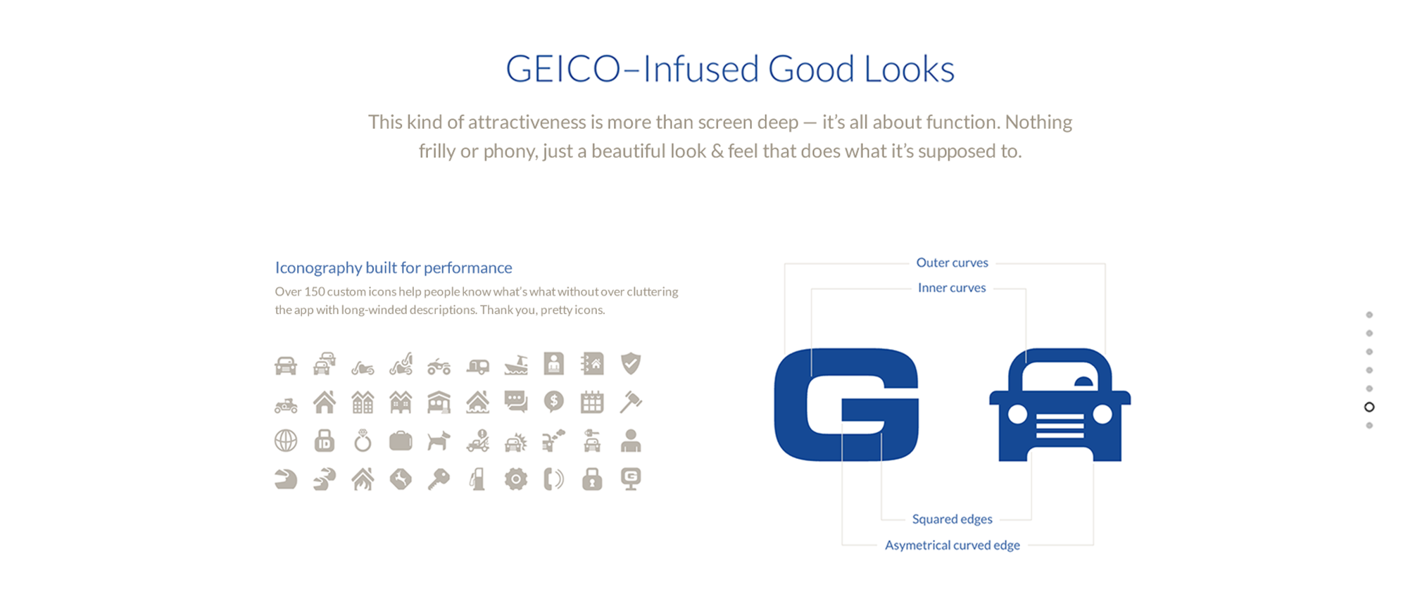
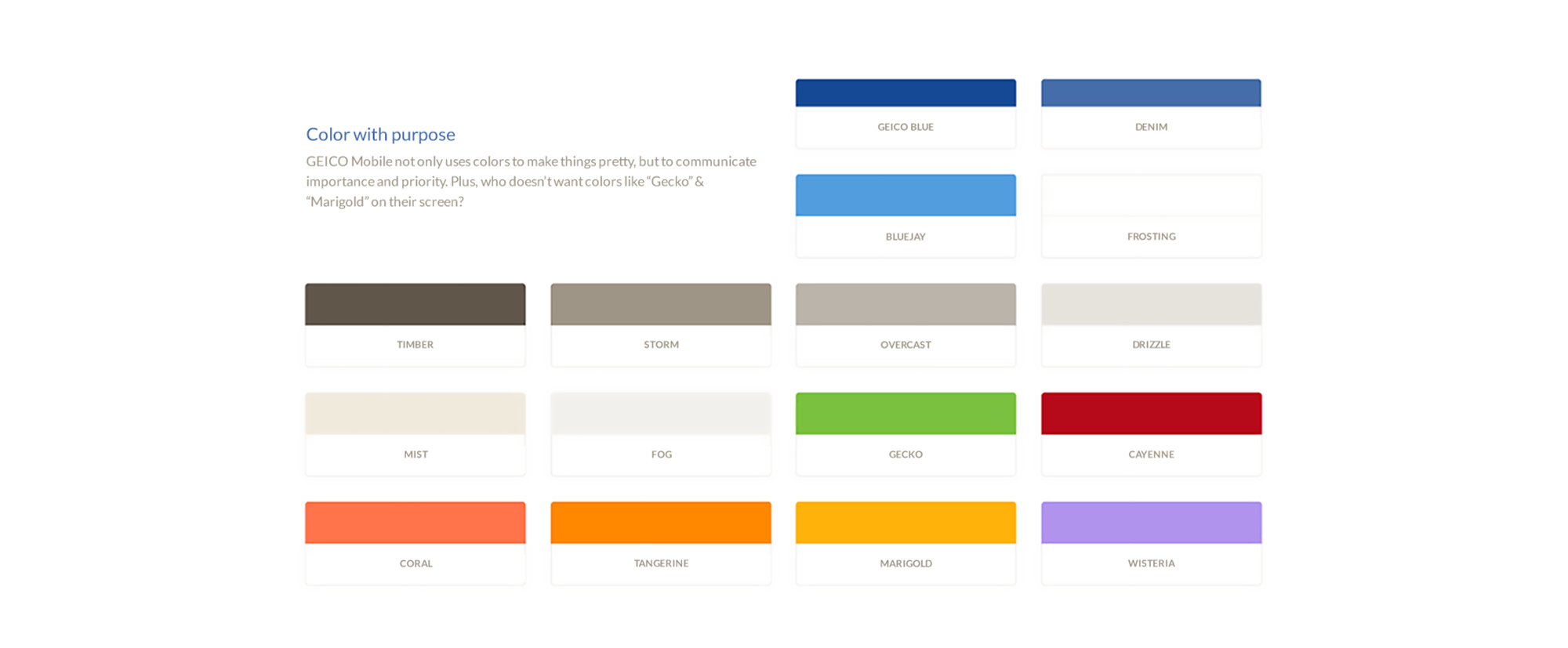
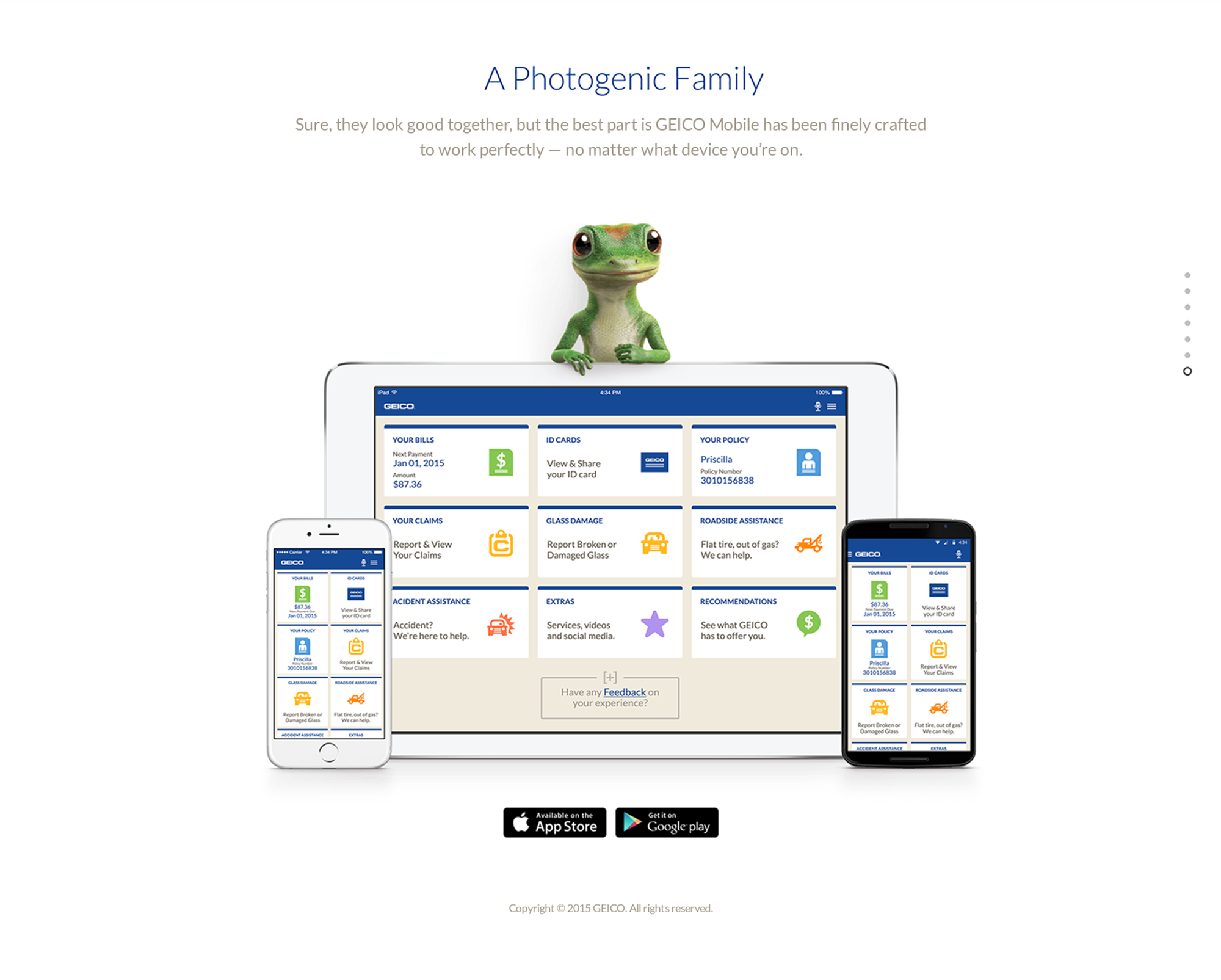
GEICO was one of our favorite clients because they gave us a lot of flexibility to reimagine the app. They had an existing app that needed a complete overhaul. The team was small, so we relied on a lot of brainstorming and closed-door sessions to get our initial ideas and user flows down. We began to flush out the different screen designs and iterated from there. Each section of the app had a dedicated icon and brand color.
SYNTHESIS
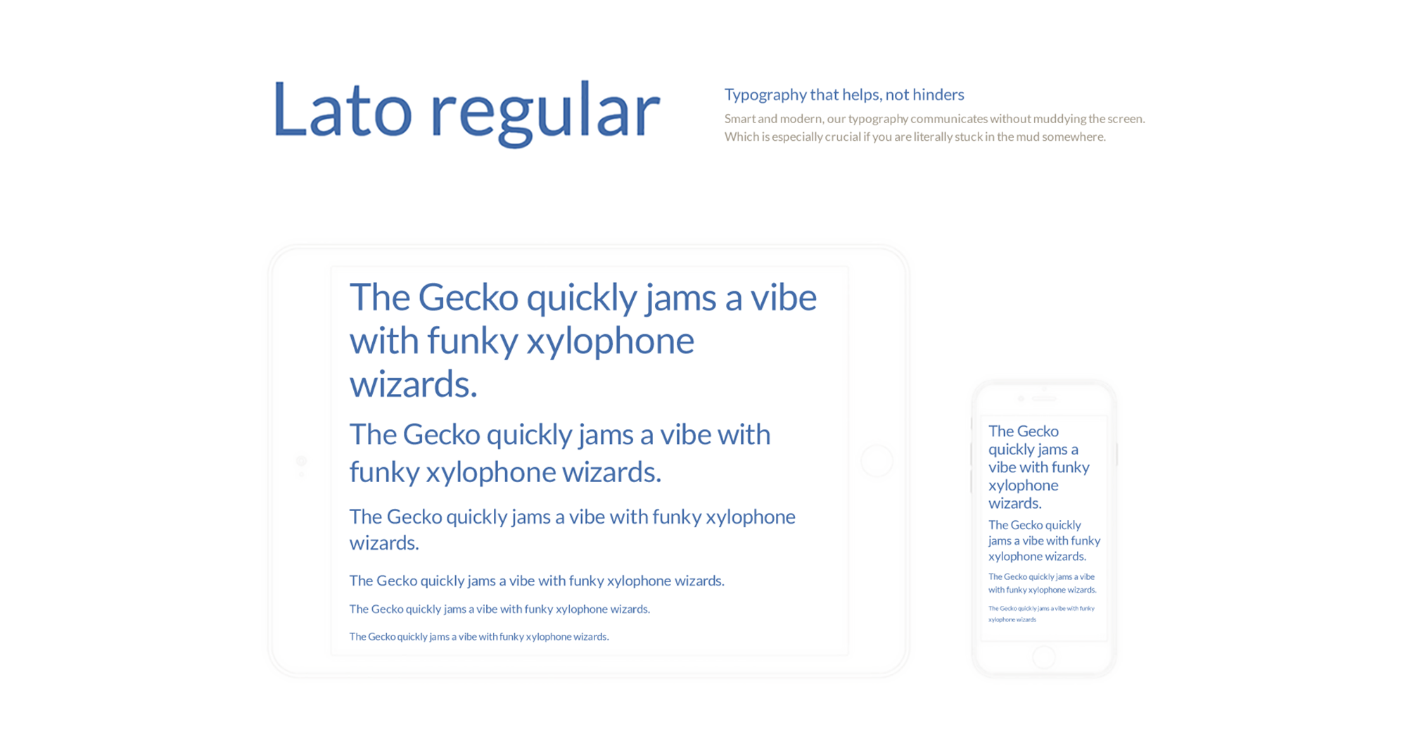
The development of the app was handled by the client. We delivered each designed screen and all of the cut assets—including an ico-moon font set, a GUI kit, and a copy deck.