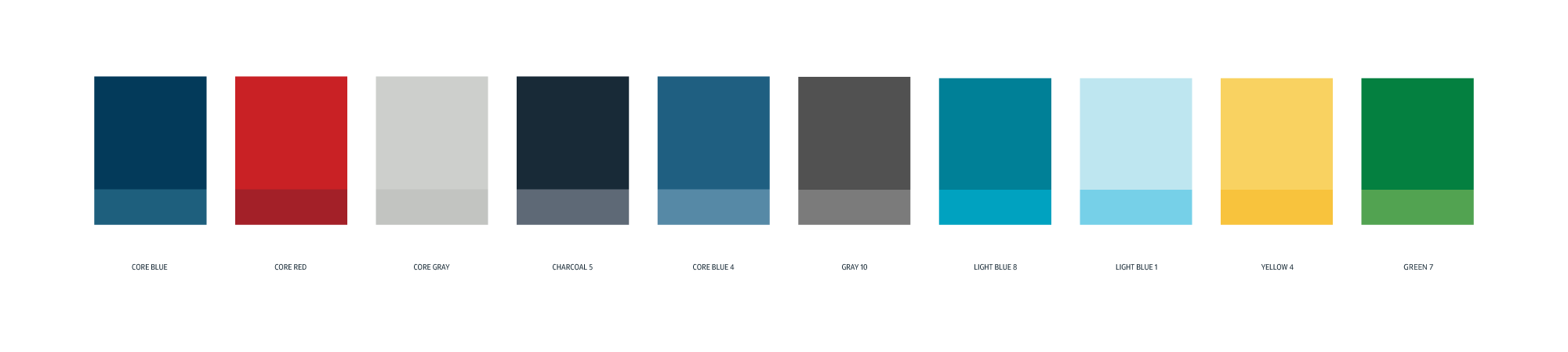
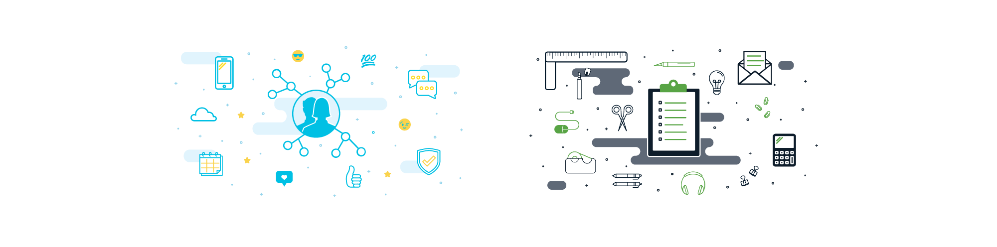
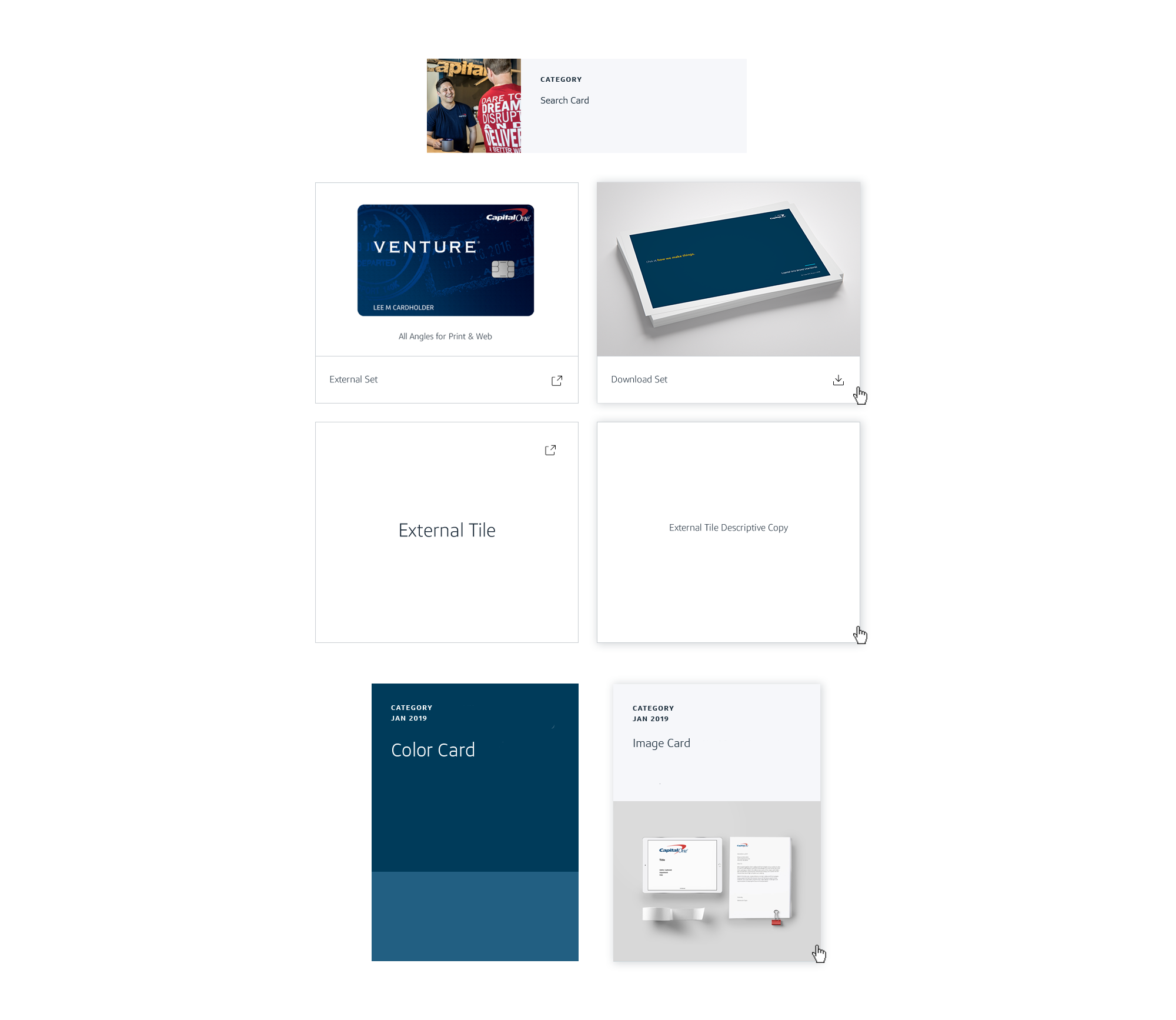
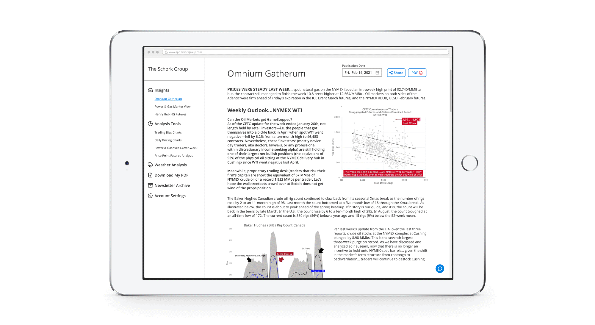
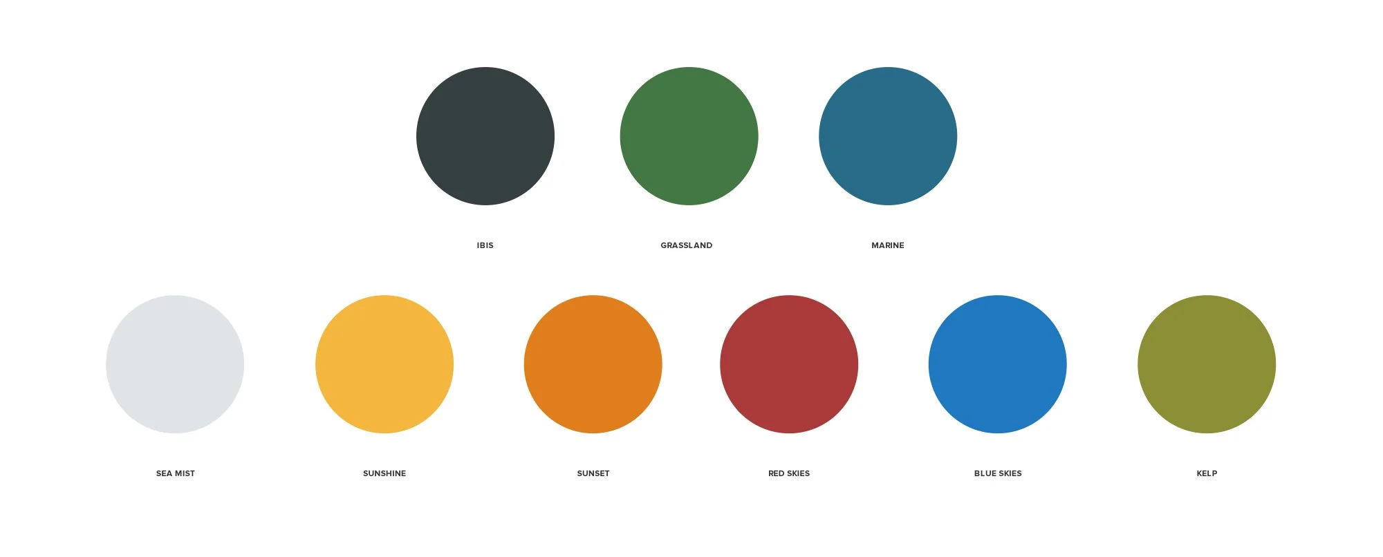
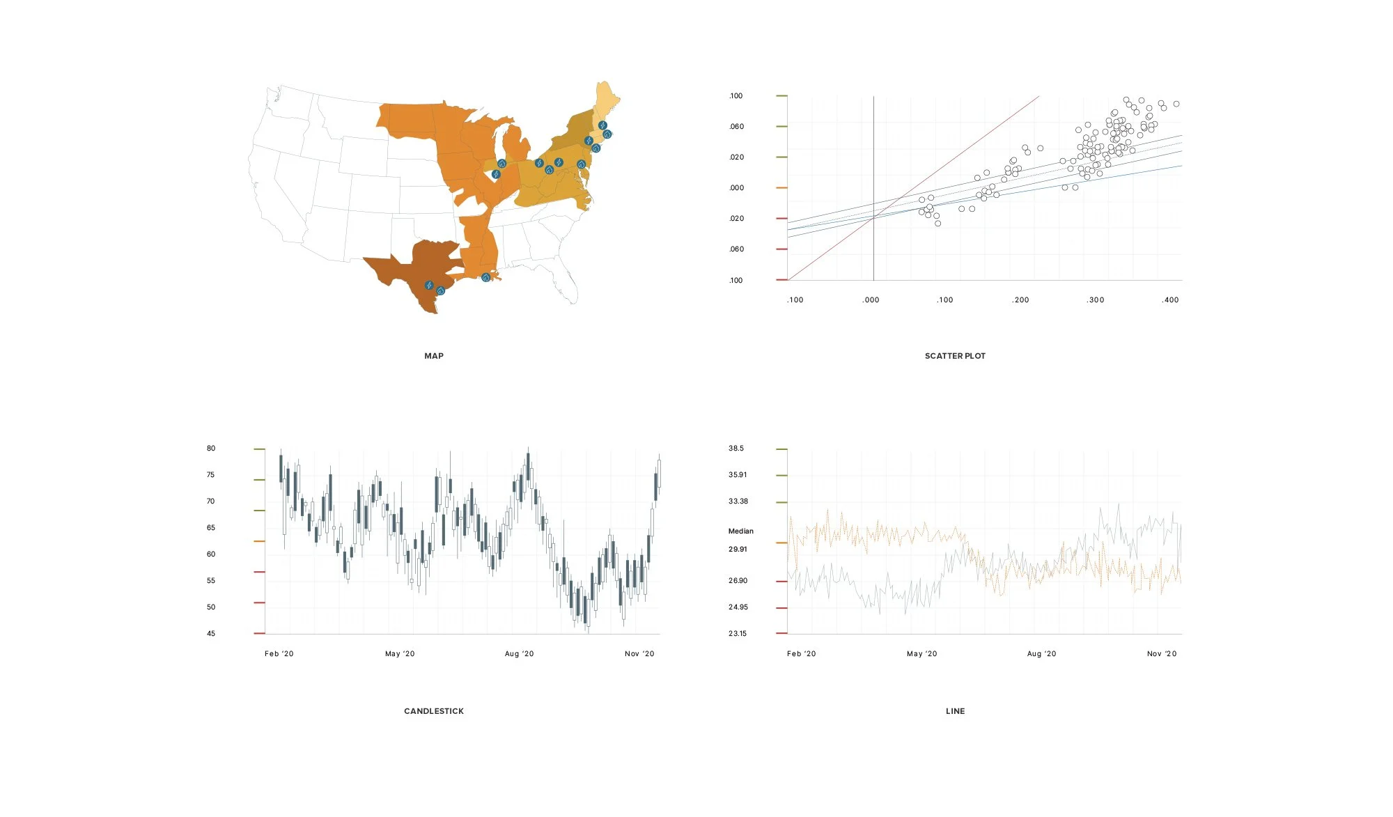
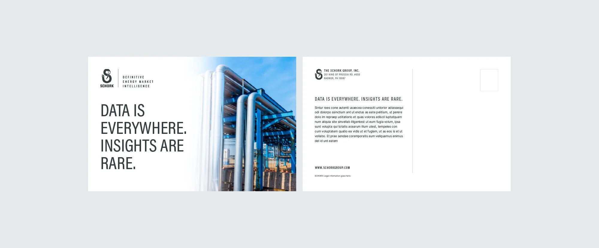
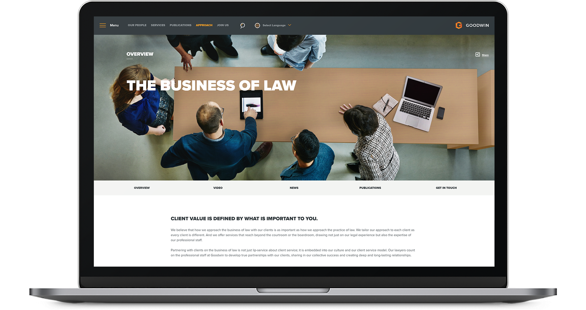
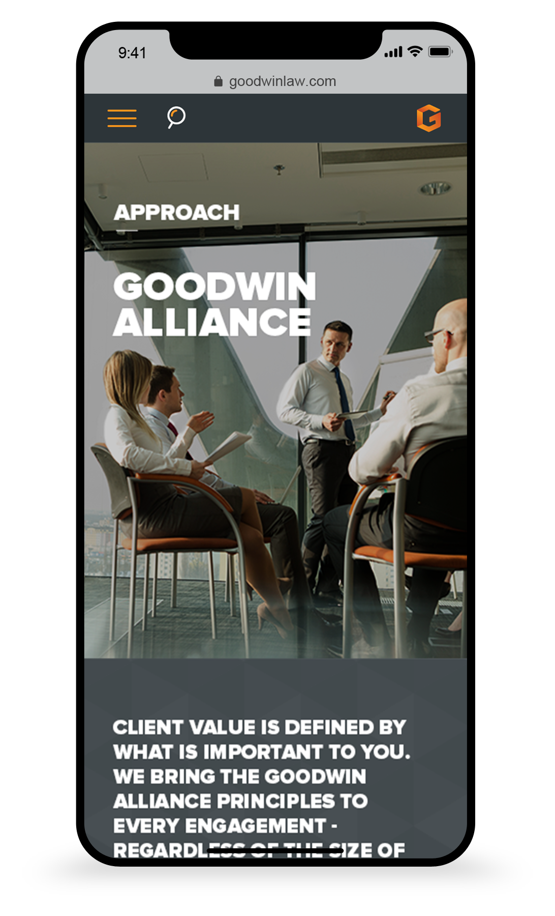
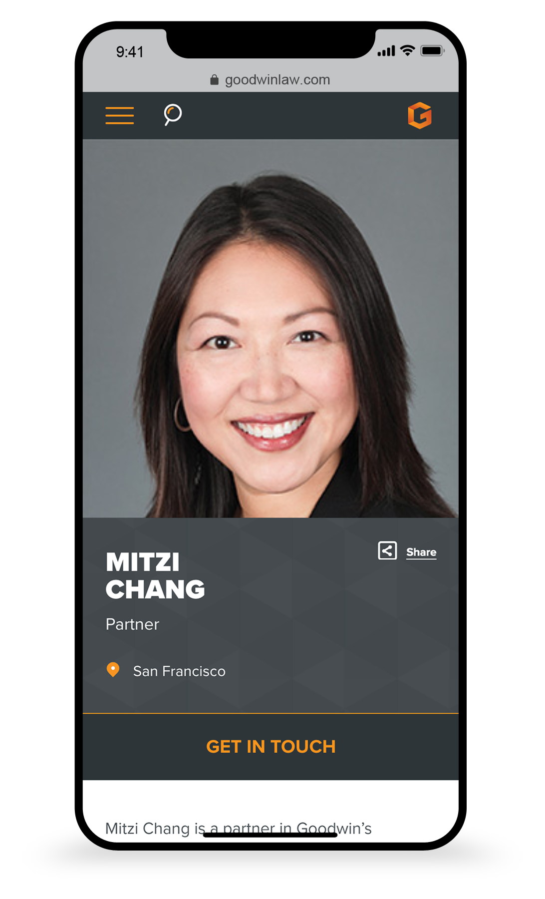
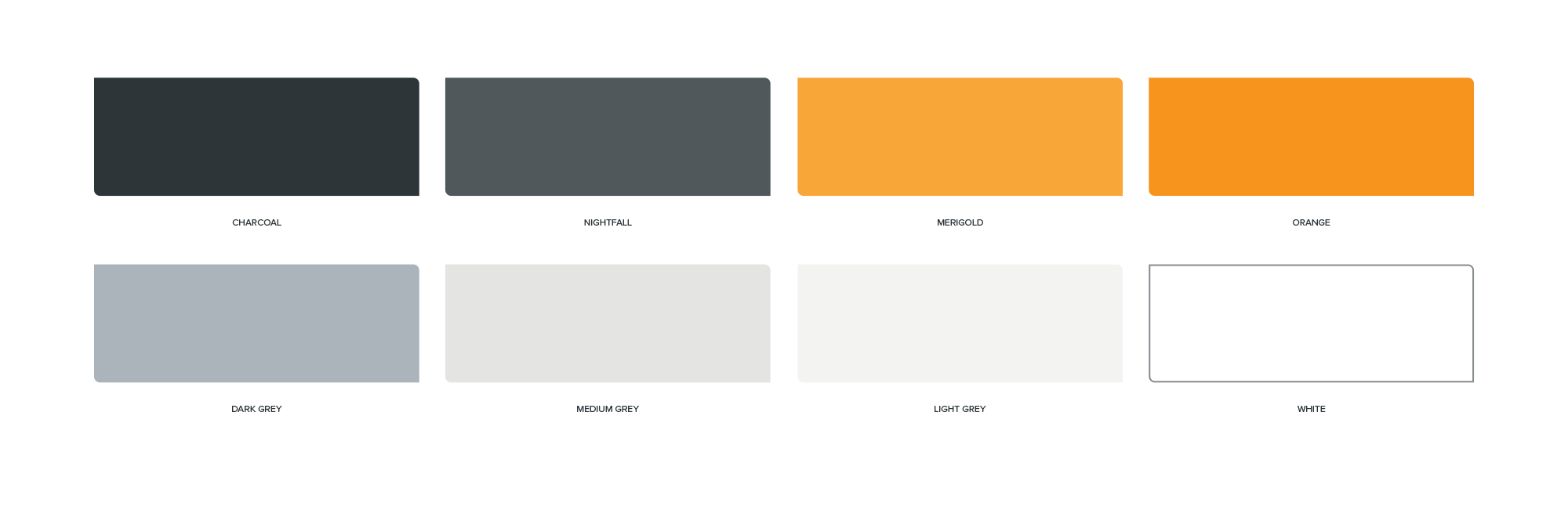
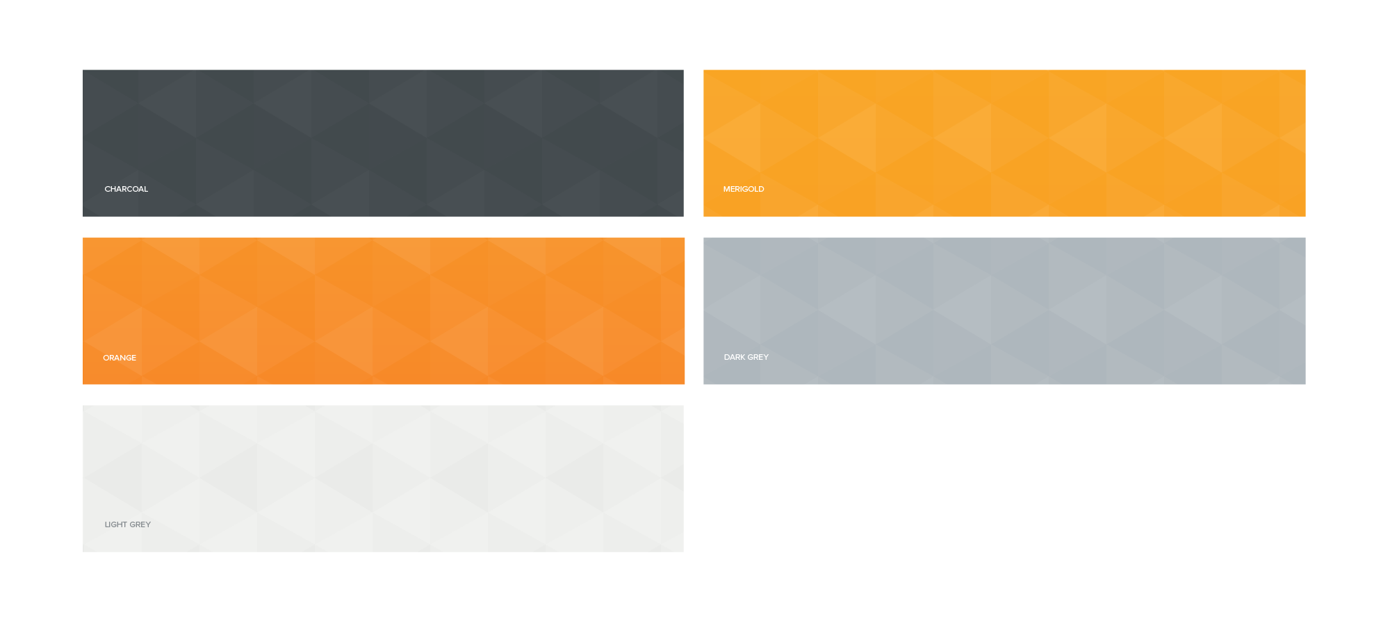
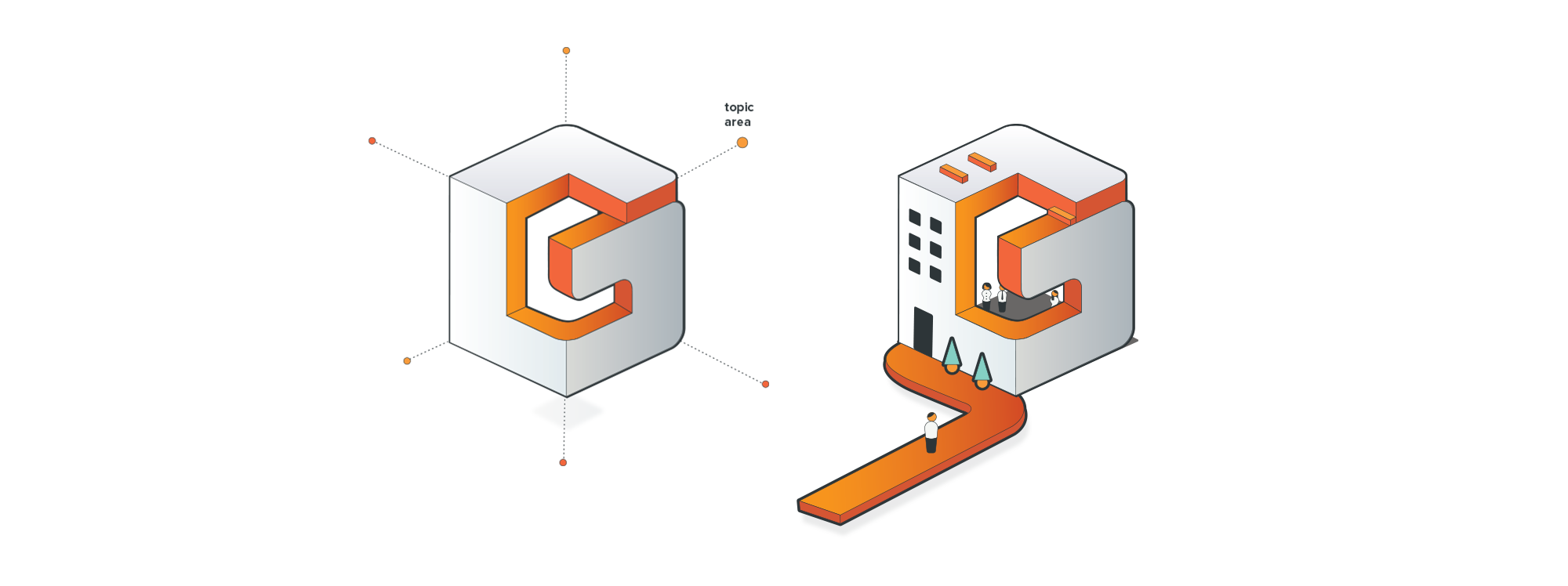
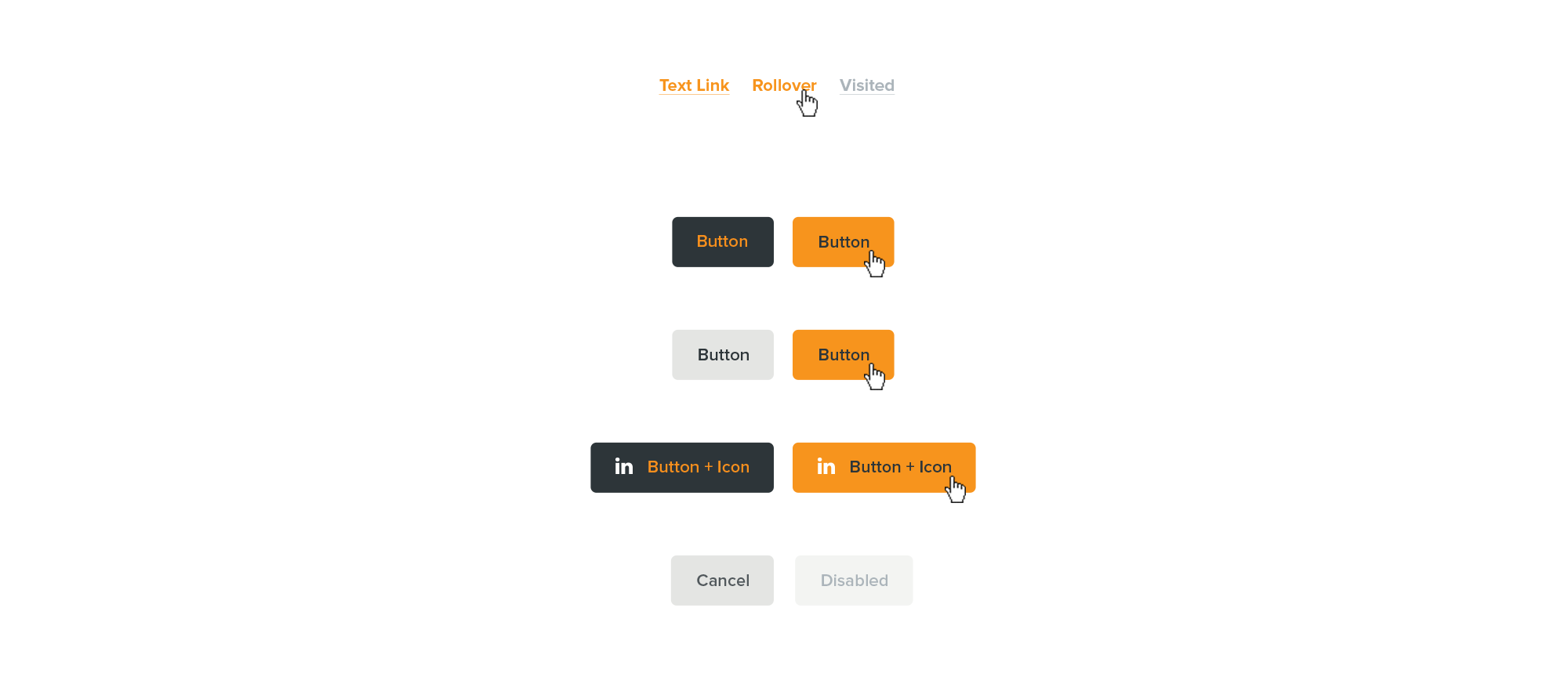
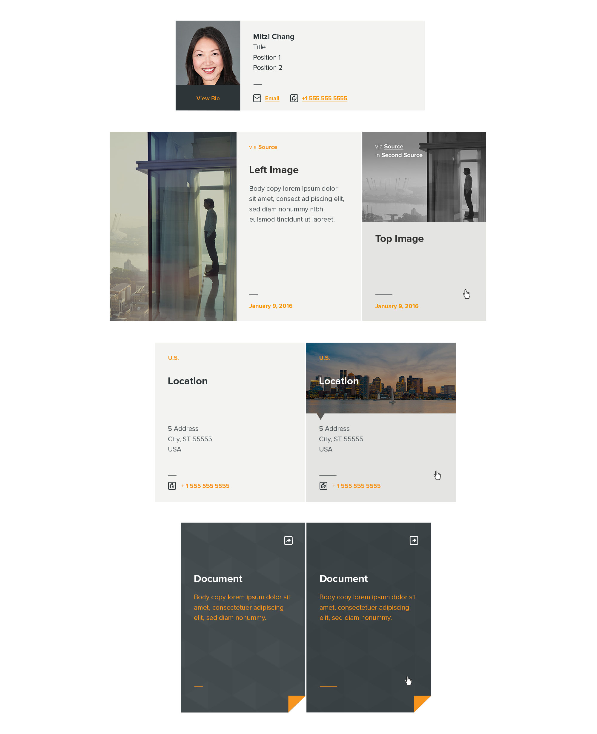
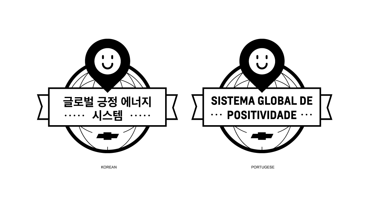
Capital One brand Portal
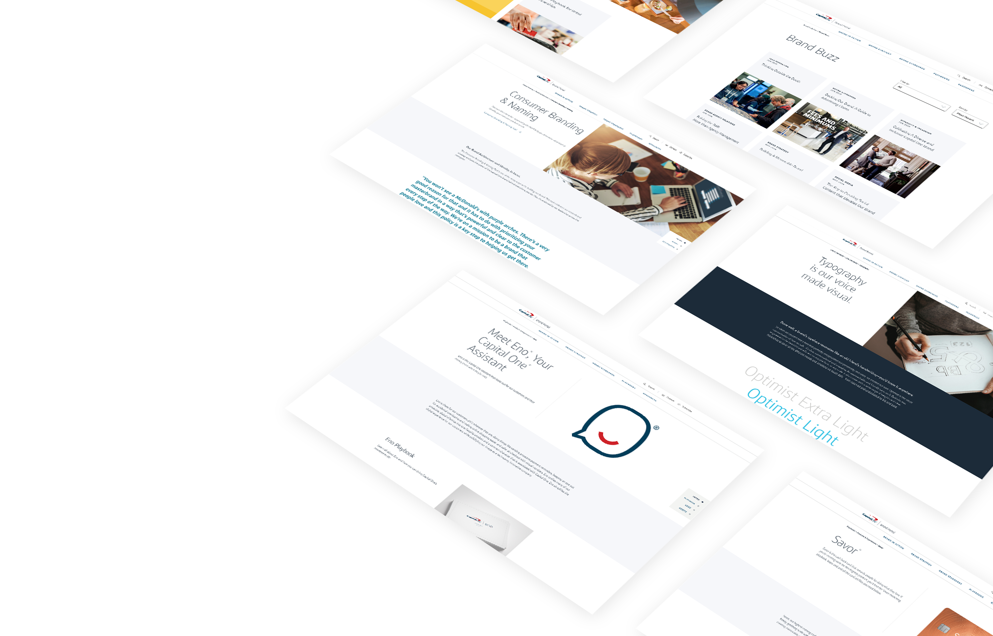
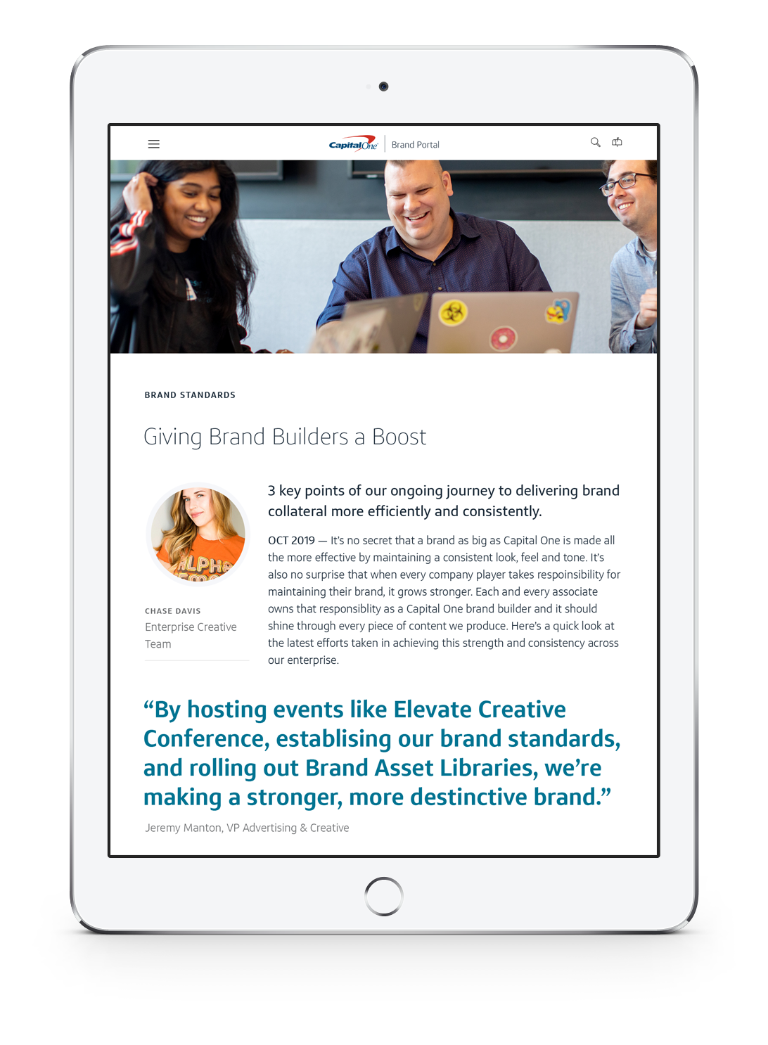
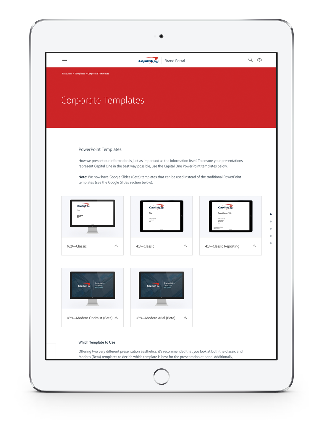
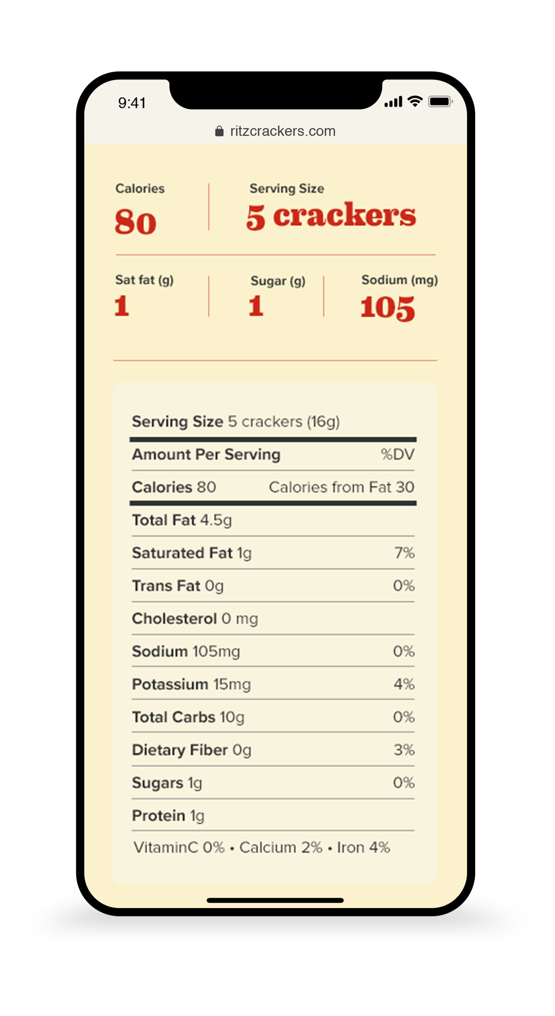
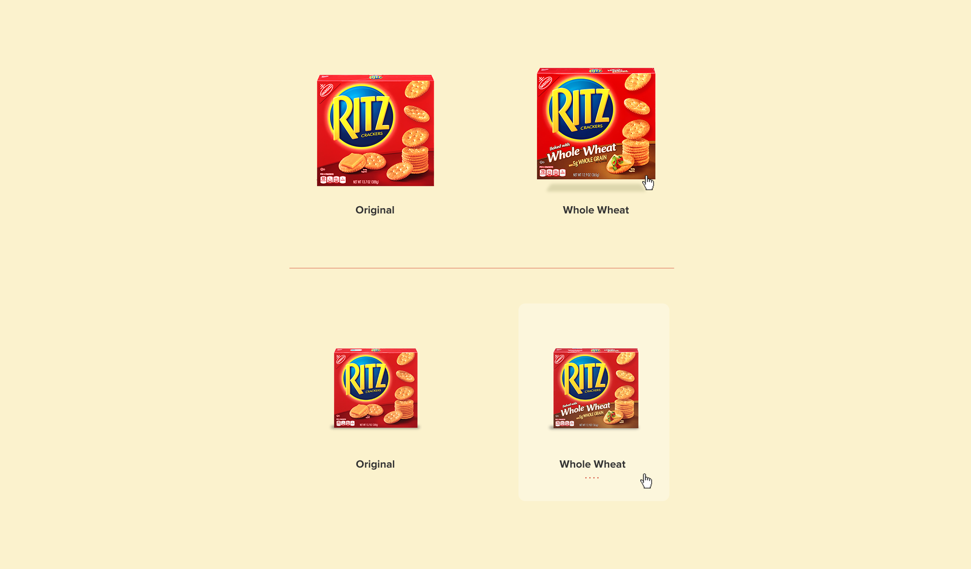
An internal site for Capital One associates and agencies. The portal served as a single source for articles, brand strategy, brand standards, and resources to better reinforce company branding. Google Analytics, surveys, and user testing influenced functionality and design. The experience combined a proprietary digital system with a new UI to reflect the evolving brand standards. Column-based modules create an array of page layouts set up with an in-house CMS and DAM.
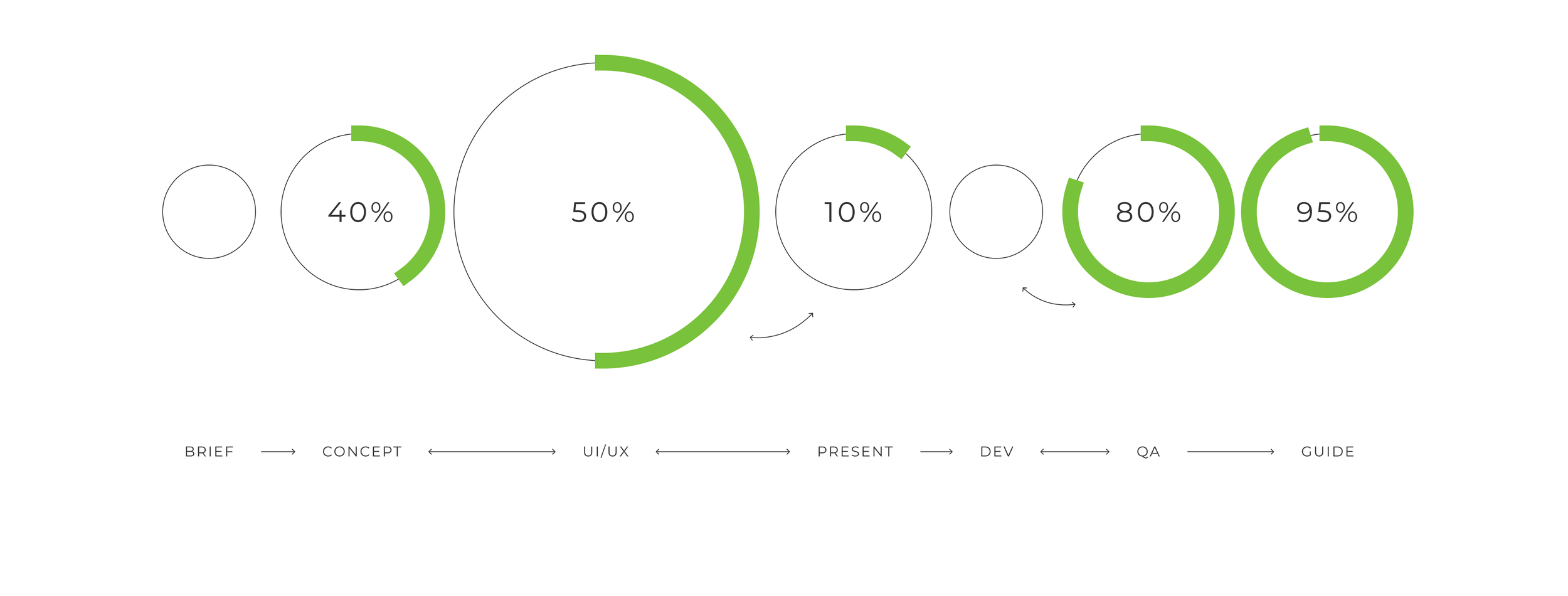
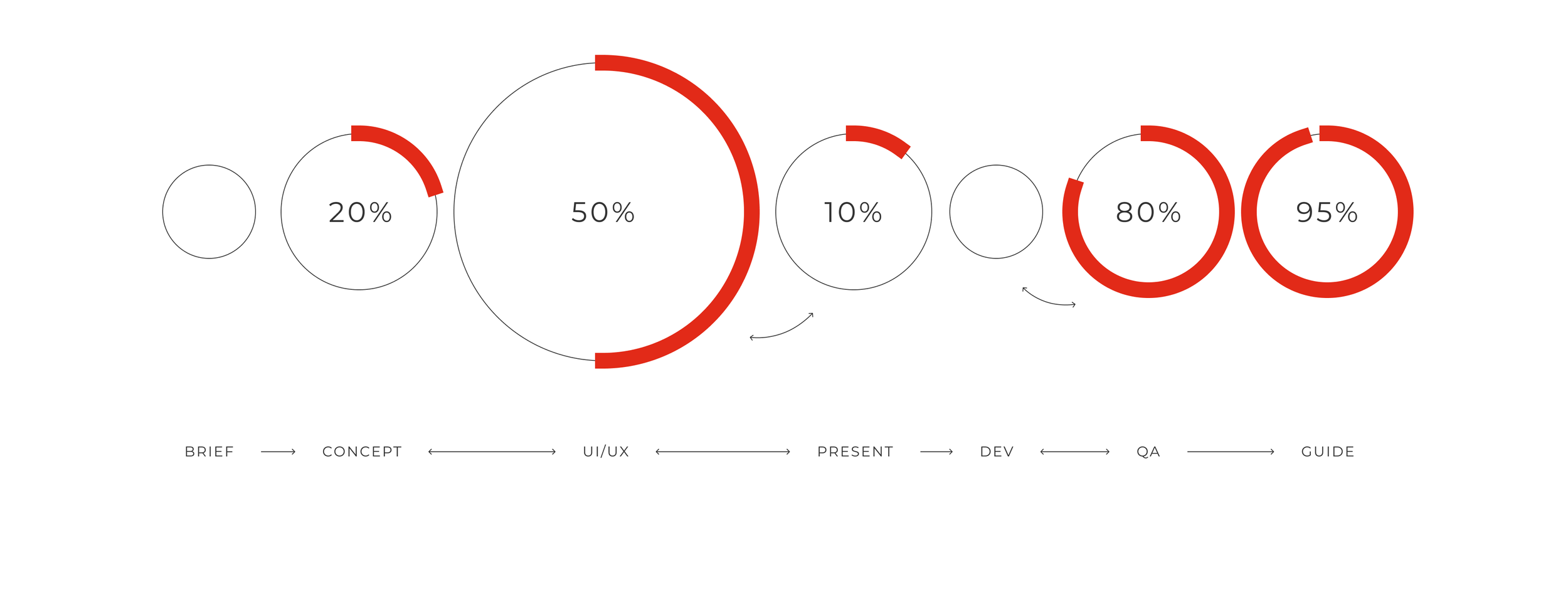
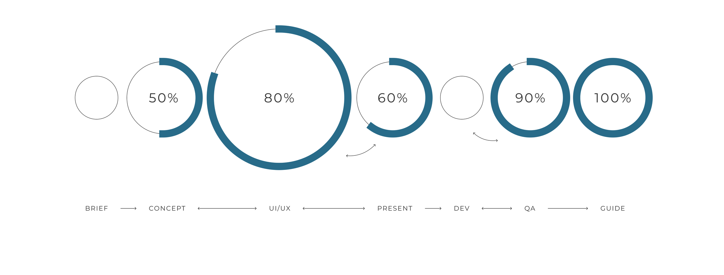
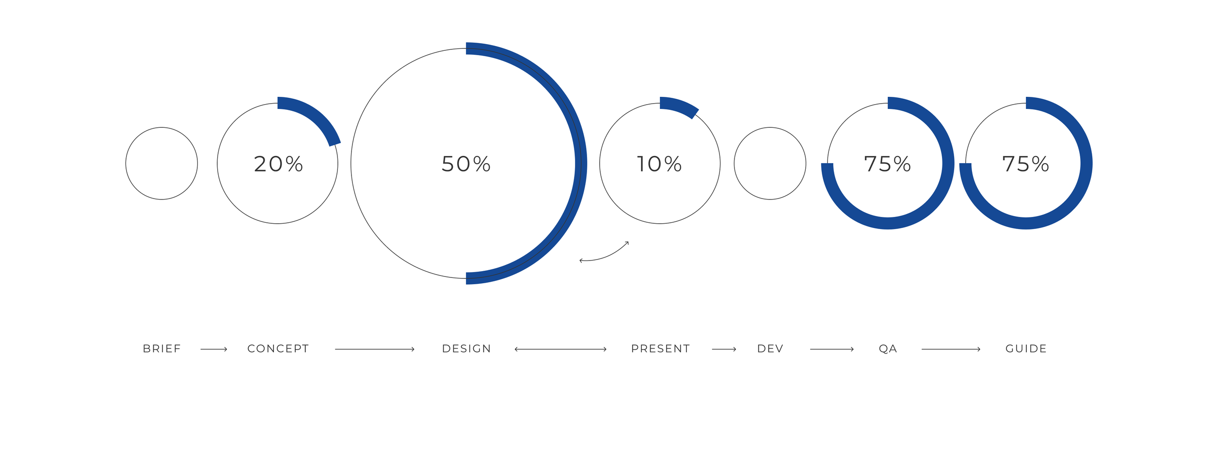
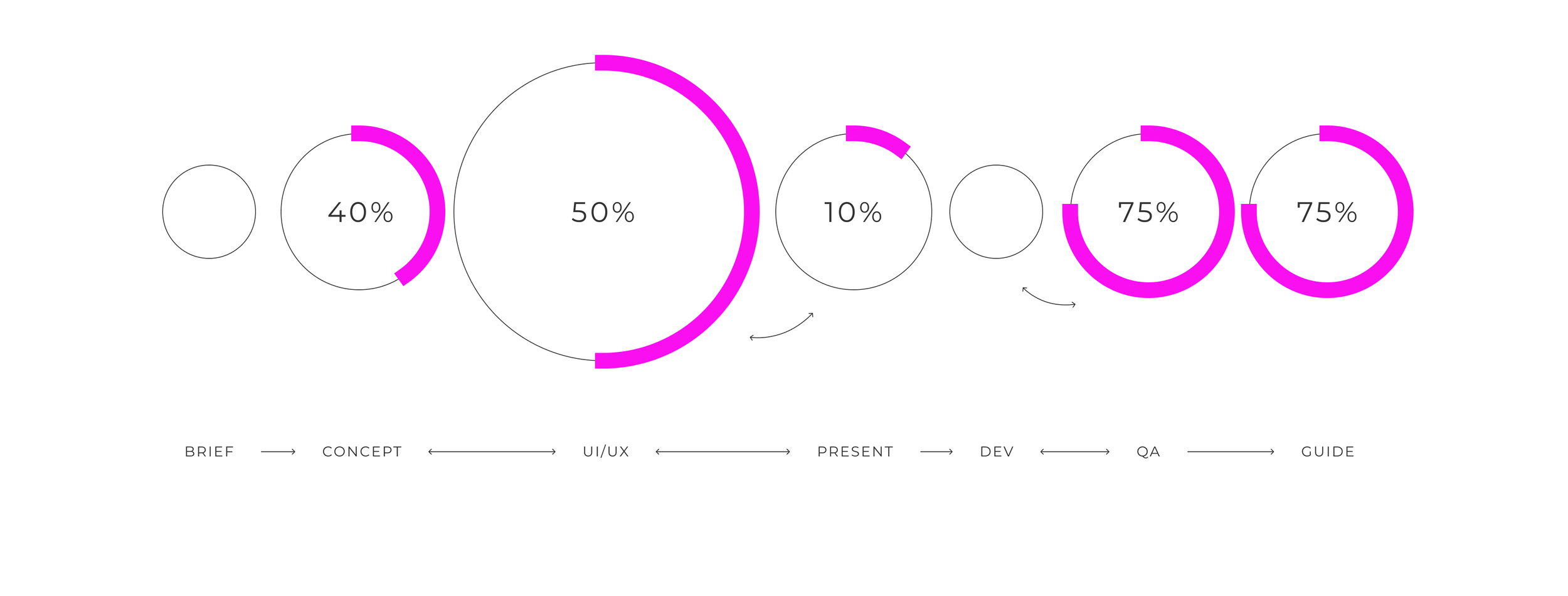
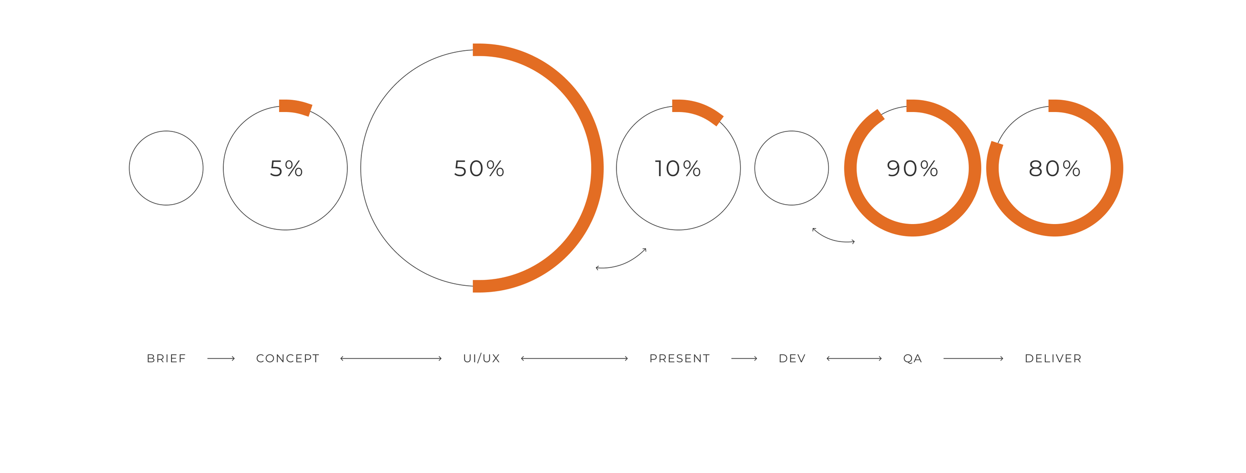
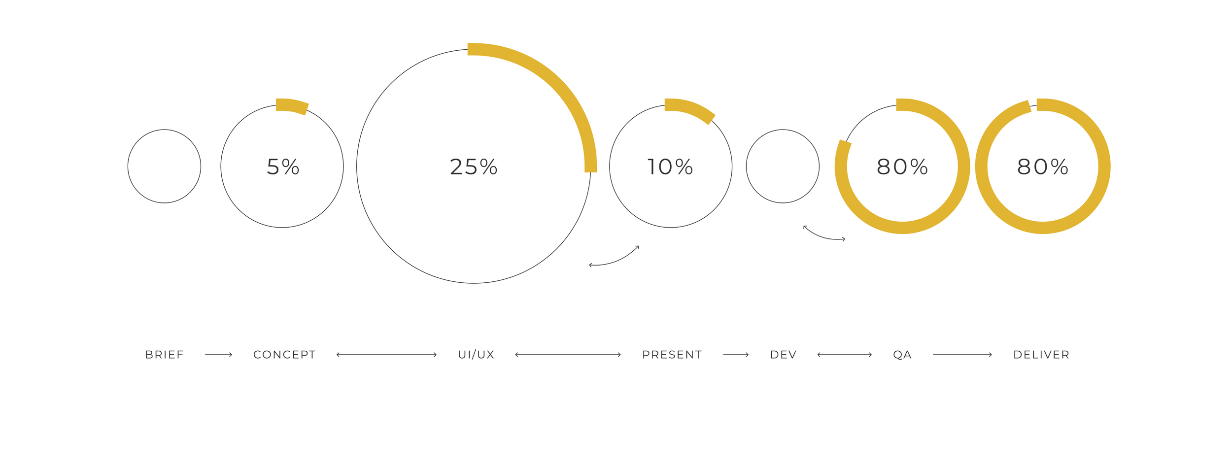
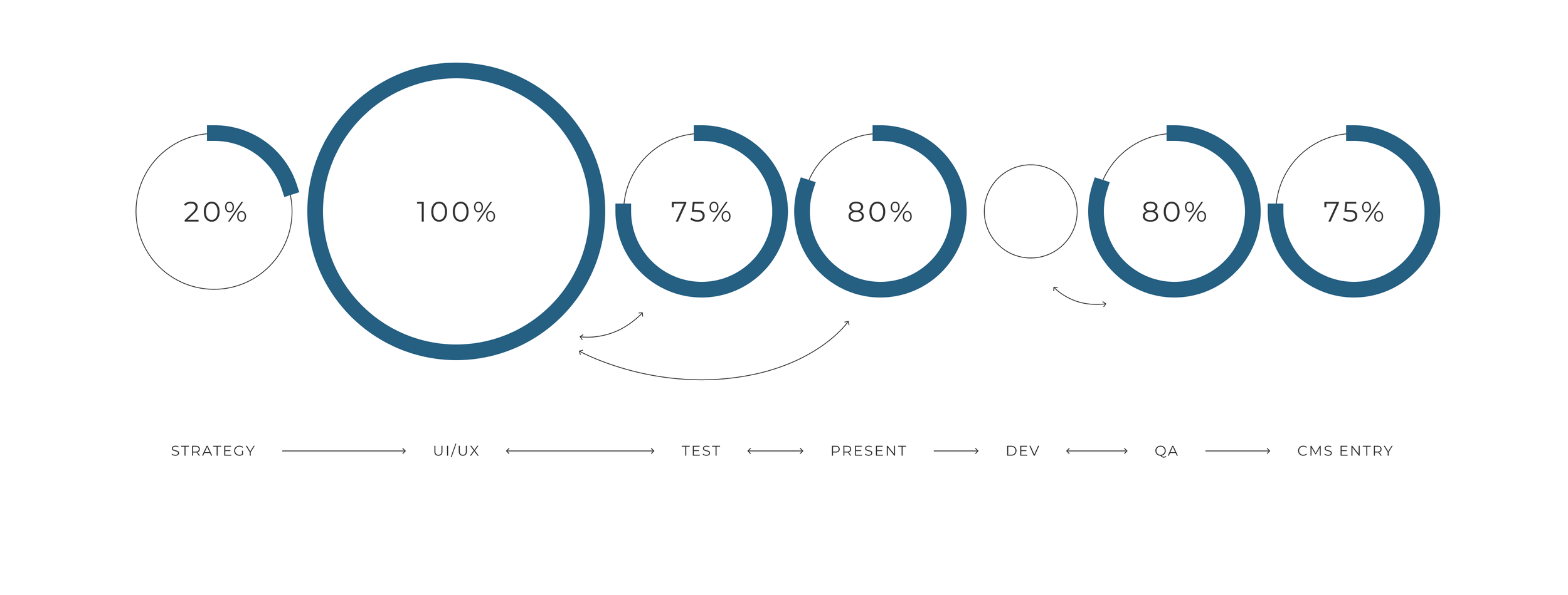
Process & Role
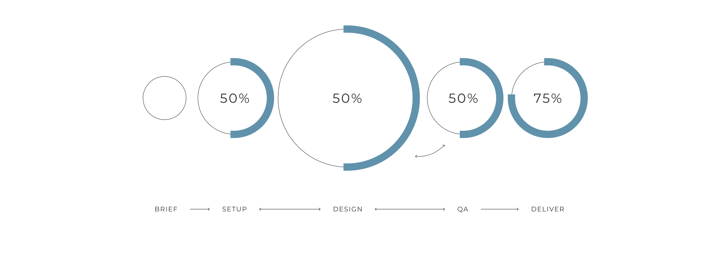
TIMELINE
2YRS+
Lead Art Director, UX/UI Designer, QA
RESEARCH & ideation
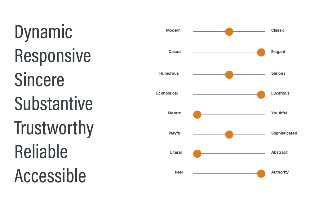
I attended large stakeholder strategy sessions and contributed competitive research to align with the look, feel, and direction of the site. I then designed and prototyped solutions that I presented to the creative director and the executive team.
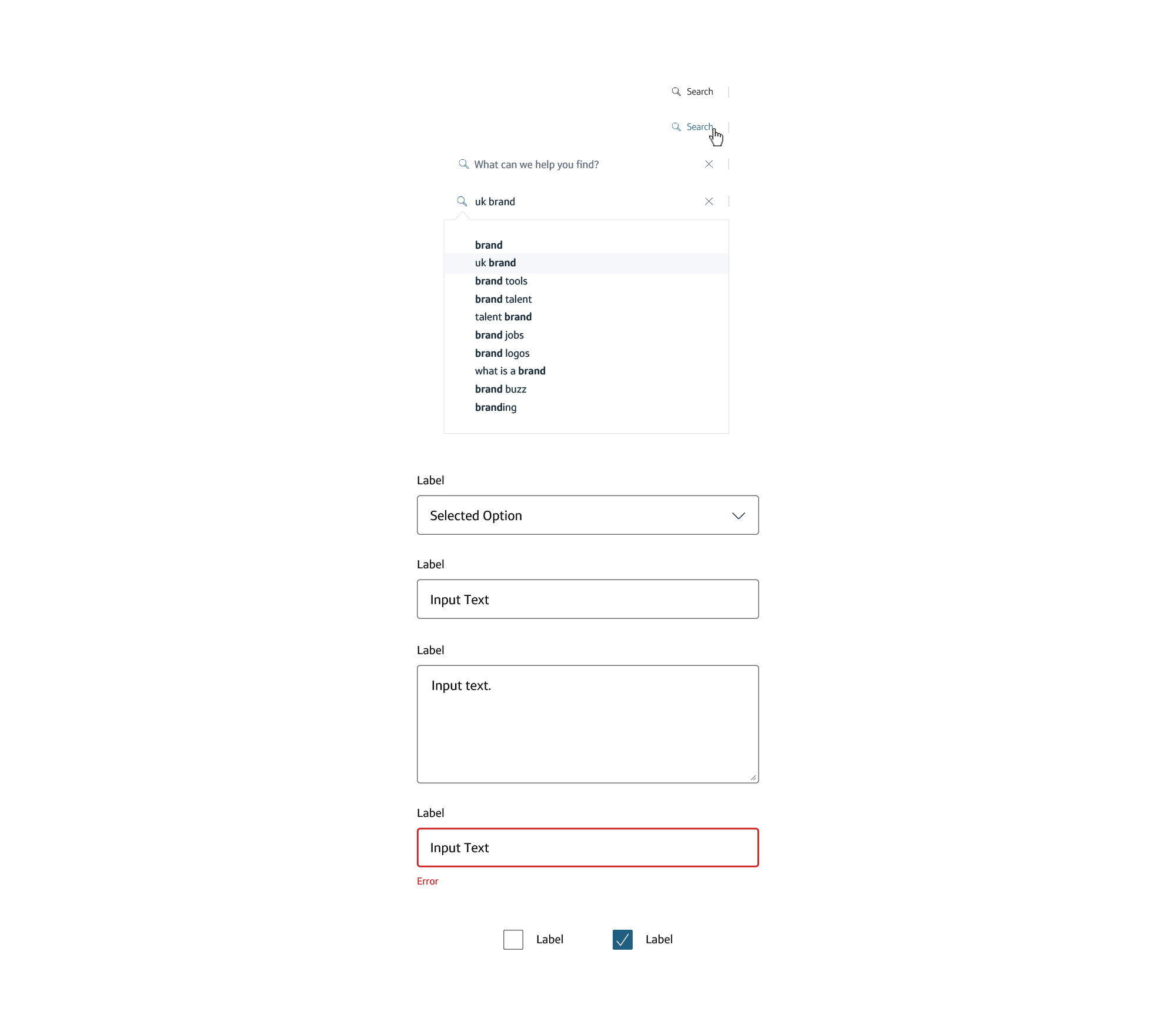
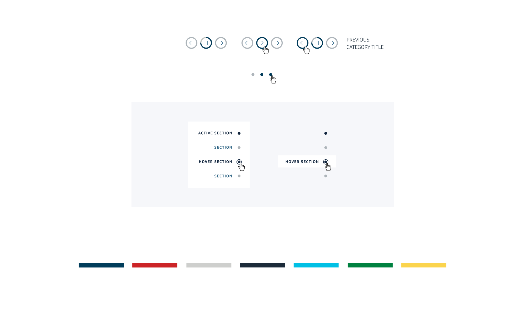
Wireframes & testing
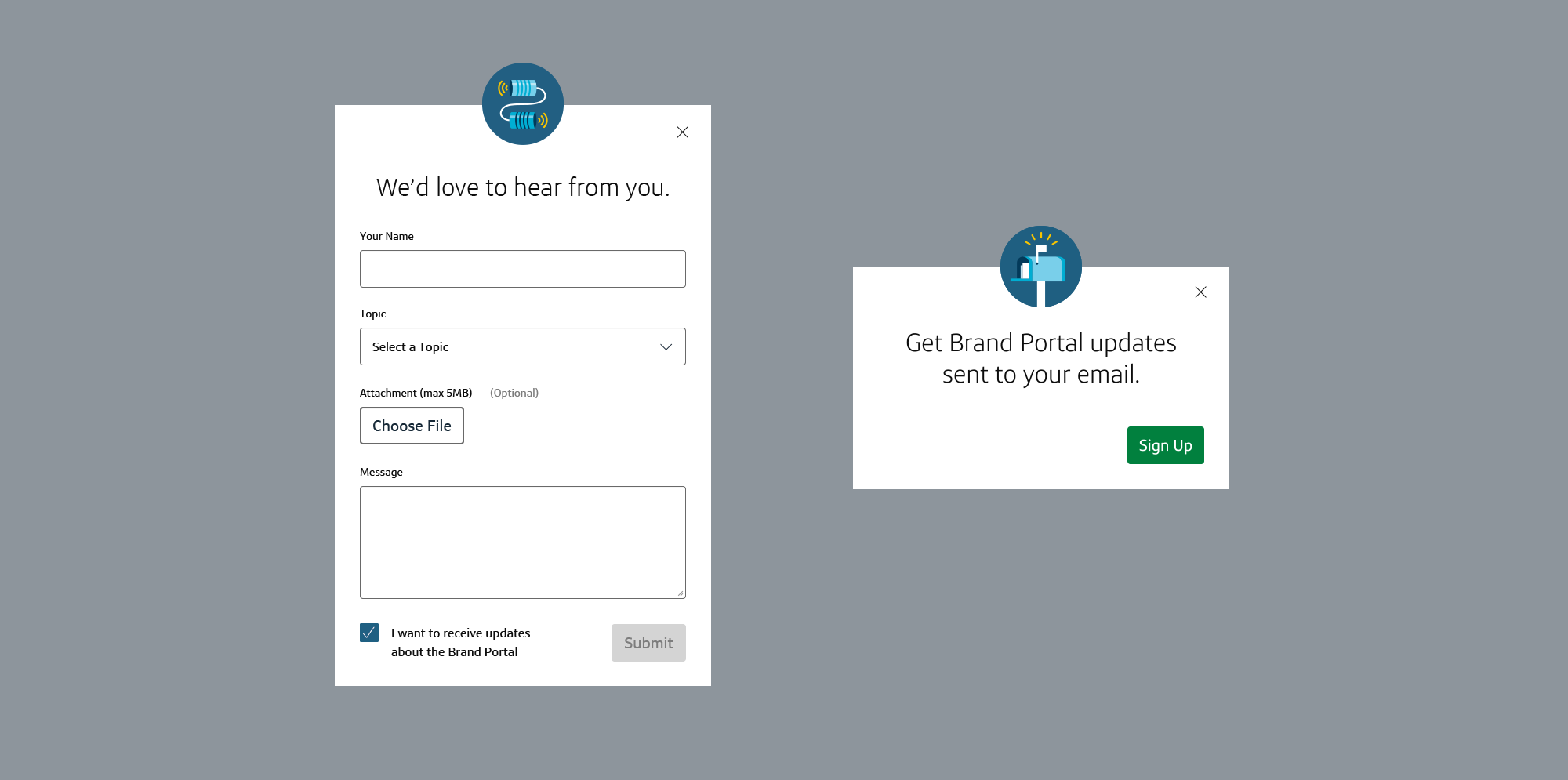
Further along in the project, we conducted usability and user tests internally to validate tools and flows. I was tasked with outlining the goals and designing the prototypes for testing. We used UserTesting.com and shared the link with "Brand Champions" and teams within the company. Google Analytics was also used as a basis for control.
SYNTHESIS
Pixel-perfect PDFs were my only handoff for development. Once the staging link was received, everything was painstakingly QA-tested. I also played a large role in the CMS entry in order to maintain the desired hierarchy and aesthetic for each page.
Once the Capital One Brand Portal soft launched, we began to refine key integrations and focus on customization and notifications for the site. We continued to use month-long agile sprints for improvement releases.
I later made a study guide for how to create and input Brand Portal pages. This was used as an onboarding tool for new contributors to the Brand Portal's news and new page content.